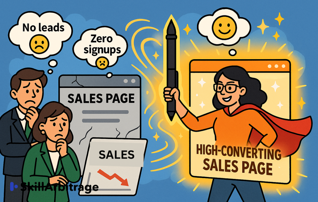
This blog outlines the techniques to deliver a high-functioning sales page in eight easy steps. This would be a practical guide for content writers and business owners who want their fantastic offers to translate to sales with a high-converting sales page.
Table of Contents
Introduction
Life as a content writer often felt like being a firefighter, constantly putting out fires. That thought crossed my mind one Saturday morning as I woke up to four missed calls, two emails, and several WhatsApp messages from a new client. They ran an ed-tech brand selling online courses to a familiar audience: content writers. I had previously written a few ads and blogs for them, so I knew their tone, their market, and now, their emergencies.
I resigned to the fact that my peaceful Saturday morning was slipping away—I jumped on a Zoom call, not knowing it would snowball into a full-blown content crisis meeting.
My client and his marketing head were both very upset. They had launched an offer for a special blog writing course, but there was a problem…no one was enrolling!
If people did not enroll, they would have to scrap the course, which meant losing the money already spent on building the course and running ads.
At that point, I asked them if they had a sales page.
The CEO said, “Yes, but it was not working. We had a decent set of ads and quite a high budget. I thought that was enough.”
Sadly, it wasn’t. Ads on Meta or Google raised awareness and interest in people, and a decent email sequence warmed them up, but the audience refused to budge without an effective sales page. I told them about this issue.
The CEO then asked, “What do you think an effective sales page can do?”
I perked up a little, we were talking about my favorite subject now. Sales pages were super satisfying to write.
They needed some technical skills and know-how, but their effect was electric. Offers that no one seemed to care about suddenly sold out like hotcakes or tickets to a potboiler.
Sales pages are the digital equivalent of a top-tier salesperson, working 24/7 to pitch a product or service. According to HubSpot, businesses with optimized landing pages (a close cousin of sales pages) see up to 55% more leads.
I said, “Sales pages can be tricky. Just writing well does not quite cover it. It has to have psychological insights and address pain points. After all, your sales page is your 24/7 digital salesperson. If it’s not converting, it’s likely because it’s missing key psychological triggers. Let’s fix that.”
Understanding the psychological triggers meant understanding the audience. This was also the first step in writing an effective sales page.
Step 1: Know your audience
The CEO said, “I know my audience; they are mainly educators and content writers”.
That was not quite covering it.

That was just a description of what they did, not who they were.
I had to break it to him gently.
I said, “We need to go beyond demographic data and look for real pain points, their dreams and aspirations…things that keep them up at night. And it was something not very difficult to do. Platforms like Reddit, Quora, and Facebook groups can help you see real discussions around your niche…
…You could also launch social media polls, and surveys, and ask people exactly what they were looking for in a blog writing course, what challenges they wanted to overcome, and what problems needed solutions.”
The CEO nodded thoughtfully and went on to show me the sales page they had. “See, we have a clear headline in big fonts, but still…”
I resisted the temptation to roll my eyes. The headline said – Launching Our Superior Blog Writing Course. The most generic headline ever, and did not offer or promise, it was just a general announcement.
It was obvious why it did not work.
Step 2: Craft a powerful hook (headline + subheadline)
I said, “Your headline has to instantly convey the value of your offer. There’s a formula to it —[End Result] without [Big Obstacle] in [Short Timeframe].”
Example: “Write Blogs that Attract Leads and Build Authority without Hours of Research, in Just 30 days!”
A strong subheadline should immediately support the claim by adding credibility or curiosity.
Example Subheadline: “Using a Failsafe 5-Step Framework Backed by Psychology.”
I could see understanding flash through his eyes. A strong hook creates an urge to act immediately.
Step 3: Agitate the problem and create an emotional connection
The CEO said: “I explained to the audience what they will get and what they will achieve on the page, but that did not make it sound urgent.”
This, too, was a common problem. It was a simple case of putting the cart before the horse.
So, I told him, “You need to highlight the pain before presenting the solution.”
Example: “You’ve spent hours hunched over blogs on how to write blogs. You are passionate about writing. But writing a blog that actually adds value? Still seems like guesswork at best and unattainable at worst. We know that frustration. The feeling of seeing someone much less experienced or skilled than you do what you can’t, yet!”
See how this makes the audience feel seen, heard, and overall, understood?” I asked.
PAS, the content formula I used in the introductory paragraph above, was ideal for writing a super-effective sales page: Problem- Agitate- Solution. This was the magic mantra to sales pages that converted.
The CEO said, “Yes, I get it, but what about the features? We teach better techniques and have better faculty than anyone else. Surely that should have made a difference!”
Well, to be honest, this was another misconception.
Everyone thinks their products are better. But better than who, exactly? How would your audience know that you are better? What does it mean for them?
Sadly, absolutely nothing.
If you are selling a washing machine, most of your potential consumers know nothing about how technologically advanced the motor is, but they do understand that now it would take them less time to do the laundry.
That, right there, was the power of benefits.
Step 4: Benefits over features
I had to elaborate on this a bit for his benefit. “Unfortunately, features have very little bearing on the conversion; they are mostly just a list of things. Benefits are what really sell things.”
Feature: We offer AI-powered assessments.
Benefit: Our accurate AI-powered evaluations can reduce your revision times to 80%, and focus on writing more instead of revising the same blog repeatedly.
Describe what your product is, how it solves specific pain points of your audience, and add credibility with testimonials or, failing that, case studies.”
.“ We have testimonials!” he added happily.
I saw those testimonials; they were just names of students who had passed out, and you had to really scroll down a lot to see them.
No, this would not do. Obviously, I did not say that out loud.
Step 5: Add proper social proof where people can actually see it
Instead, I said, “If you can bring that whole testimonial section up a bit, right after where you talk about the solutions, that can be a game changer! And putting them in a before-and-after format, that would be pure gold.”
Also, never forget the honorable trust badges like media mentions, partnerships, etc. This section was all about establishing credibility. The more authentic the testimonials look, the clearer their achievements, and the more likely the audience is to sign up.
Some popular trust triggers were:
- Real customer testimonials with names and photos
- Media mentions or industry awards
- Money-back guarantees and risk reversals
- Video testimonials for authenticity
The CEO was looking perky, and I was feeling exhilarated.
This was some solid, good work being done! After the modifications, I did not doubt that the sales page would be super effective.
The CEO went on to add, “People are visiting the page, you know. We can see the page visits and traffic, but they are not acting on it.”
Aha! This was the problem with the copy on sales pages that did not create urgency.
Step 6: Create scarcity and urgency in the copy
I said, “ We need to create urgency in the language. All it would need is tweaking.
We could talk about a soon-to-close booking window.
Example: Hurry! Enrollments are closing in 48 hours!
Or we could create a scarcity of seats…
Example: Book now, only 10 seats left.
Immediate rewards upon booking could also be offered.
Example: Book in the next 48 hours and get a 5% discount on course fees.”
Without scarcity and urgency in the copy, the audience does not feel motivated to take action, no matter how convinced they are by the product and the offer.
Next, the CEO said, “And what about that CTA button? We have designed a big red button for it, but it just does not work, does it?”
I took a closer look at the CTA, and sure enough, the button was big and red, but all it said was “Book Now.”
Of course, it did not work!
Step 7: Create a strong and effective CTA
I said, “Your CTA needs to be more action-driven and benefit-focused than it is at the moment.
Example: “Get instant access and start your career as a blog writer in a month! Or “ Yes! I want to be a successful blog writer.”
Also, please place the CTA button in multiple places.”
Placing the button in multiple places effectively negated the chances of people overlooking it.
Someone cleared his throat at this point, and both the CEO and I were startled. We had forgotten the existence of the Marketing Head.
Now he spoke.
He said, “ What about the strange reservations and objections that people have before they sign up? They say things like, what if I don’t understand, and what if I fail? We can’t waste resources in reassuring them in advance!”
He had a point there. But the way to assuage those doubts and clear confusion effectively was the sales page itself.
More particularly, the FAQ section.
Step 8: Overcome objections with FAQs
I told them: “Don’t use the FAQ section to write super generic stuff instead, use it to tackle objections head-on and dispel those doubts.”
I wasn’t sure I was being clear enough, so I elaborated, “You already know the doubts, you just told me about them, we can answer them in the FAQs.”
Example: What if this doesn’t work for me? We offer a 30-day money-back guarantee, so there’s zero risk.
Here’s what the anatomy of a Sales Page looks like.
Understanding the anatomy of a sales page
Here’s the core structure:
- Headline: Grabs attention and promises value.
- Subheadline: Clarifies the offer and hooks the reader.
- Hero Section: Highlights the big benefit or transformation.
- Problem-Agitation-Solution (PAS): Identifies pain points and offers relief.
- Features & Benefits: Shows what’s in it for the buyer.
- Social Proof: Builds trust with testimonials or data.
- Offer & Pricing: Details the deal and creates urgency.
- Call to Action (CTA): Drives the final click.
- FAQ: Addresses objections.
- Footer CTA: Catches stragglers.
Here’s a flowchart to make this even easier.

It was a long call, but I was happy that I could help them out.
Sure enough, in three days, their Marketing Head called, “We implemented the changes and already, 50 people have signed up! And we are expecting more!”
Maybe he wasn’t expecting to see results, but I was. I had seen it work on multiple occasions. Writing Sales pages was both a science and an art, and the brands that nailed them reaped the benefits.
Examples of some effective sales pages: decoded
Here are some examples that might be useful
Netflix
Take a look at the Netflix page.

The hook is compelling, the steps are clear, and the brand is so well-known that it does not need a social proof section.
Their “Watch Anywhere, Cancel Anytime” headline addresses convenience and risk.
Notice the CTA buttons on the page, there are several sprinkled throughout.
This page does not have a lot of copy, but it makes every word count by answering questions before you ask them.
Like, How much is the subscription?
It’s right there on the band.
What if I want to opt-out?
Cancel anytime!
Amy Porterfield – Easy Webinar

Look at the hook, the urgency (by offering a discount), and the efficiency of the problem and solution format.
And then they go on to talk about benefits.

Relevant user benefits, discounts, and reassurance make the content extremely powerful.
There is no doubt that this sales page will convert.
Conclusion
The Sales Page was finally put up after my conversation with my clients. It went on to bring in a lot more sales than expected.
Follow these 4 rules to build a super sales page. Don’t oversell, lose the jargon, be device-compatible, and don’t be generic with CTAs.

Do these four things, and your sales page will not fail to deliver.
So now, you have it: the secret to writing a super-converting sales page in eight easy steps with examples and challenges with solutions. Why don’t you go on and write one for your client or your business, keeping my interactions with the CEO in mind, and drop me a comment to know how it went?
My Saturday? Oh, it wasn’t wasted, after all, it seldom is when you are building something.
FAQs
1. What if my product/service is new and I have no testimonials?
Solution: Use “borrowed credibility.” Share data, industry research, or personal expertise. You can also include a case study from a beta tester or an early adopter. If that’s not possible, create a risk-reversal offer (e.g., a money-back guarantee) to build trust.
2. My sales page gets traffic, but no one is converting. What could be wrong?
Solution: The issue is likely in your headline, offer, or CTA. A/B test your headline for better engagement. Ensure your offer is clear and compelling. Make sure your CTA is action-oriented and placed strategically throughout the page.
3. How do I know if my sales page is too short or too long?
Solution: The length of your sales page should match the price and complexity of your offer.
- Low-ticket items (<$50) → Short, concise sales page (500-800 words).
- Mid-ticket items ($50-$500) → Medium-length page (1,000-2,000 words).
- High-ticket items ($500+) → Long-form sales page (2,500+ words with in-depth persuasion).
4. How can I make my sales page persuasive without sounding too “salesy”?
Solution: Focus on storytelling over selling. Use the Feel-Felt-Found technique:
- “I understand how you feel…” (Empathy)
- “Others have felt the same way…” (Social proof)
- “But they found that…” (Solution)
5. What should I do if my audience is price-sensitive?
Solution: Shift focus from price to value by explaining:
- How your offer saves time/money in the long run
- The opportunity cost of NOT taking action
- A cost comparison (e.g., “Cheaper than one cup of coffee per day”)
6. How can I make my CTA more compelling?
Solution: Instead of generic CTAs like “Buy Now” or “Sign Up,” use action-driven, benefit-focused CTAs:
- “Get Instant Access & Start Growing Your Business Today!”
- “Yes, I Want to 10x My Conversions Now!”
- “Reserve My Spot Before the Price Increases!”
7. Should I address competitors on my sales page?
Solution: Yes, but indirectly. Instead of attacking competitors, highlight what makes your offer unique. Use a “With vs. Without” comparison table to show how your product stands out.
8. What if my product/service solves multiple problems? How do I structure my messaging?
Solution: Focus on one core problem and position the other benefits as “bonus wins.” If you try to solve everything at once, your message gets diluted. Use “If-Then” framing:
- “If you struggle with X, then this will help you with Y and Z too!”
9. How do I handle objections before they even arise?
Solution: Use an Objection Crusher Section in your sales page:
- Identify the top 3-5 objections stopping people from buying.
- Address them head-on with logical and emotional reassurance.
- Use testimonials or case studies to reinforce your points.

 Allow notifications