This blog explores the 5 main myths about a Landing Page and gives a step-by-step guide on how to build a Landing Page from scratch in a couple of hours. It would be useful for content writers, content marketers, and small brand owners who want to set up no frills landing pages quickly.
Table of Contents
Introduction
Working for Glam, the small lipstick brand, was a roller coaster ride. Things that I liked about it:
- the product was good
- the audience showed interest
- the brand showed steady growth
Things that I disliked:
- the client’s assumptions
- how they resisted all of my ideas despite them working
- how I had to convince them of every little thing
I was listing these points down in my head while I tried to keep calm during another marathon meeting. It has been a solid two hours already. My estimate would safely be another two hours of explaining why Glam’s new matte shade had to have its own landing page.
Despite the client thinking that there was no need.
“But we have a home page and a sales page. Why do we need a landing page as well?” They complained.
“Because a landing page is not a Homepage or a Sales Page. It was a completely new ball game.” If I was going to have a three-hour meeting I was going to have my landing page.
However, the morning shows the day, that right there was the first myth about Landing Pages. There were five in total. It seemed like I would have to debunk them all.
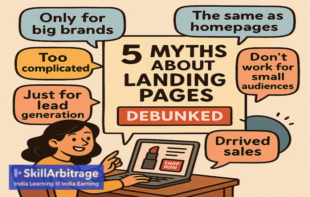
The five myths about Landing Pages
I had already encountered the first one.
Myth 1: Landing Pages are only for big brands with big budgets
Many believe landing pages require expensive tools, designers, or ad budgets, making small brands like Glam shy away from the prospect of having them.
Fact: They needed nothing extra
Landing Pages require powerful content, great visuals, and the ability to provide superb user experience. In short, nothing that any small brand, that sold online did not already have. Landing pages are cost-effective and scalable, with free or low-cost tools available for startups.
“Around 68% of small businesses use landing pages, and tools like Canva Websites (free) are there to give you professional pages without coding. Landing pages can yield a 4200% ROI through email leads or sales.
It was pretty simple.
If 1,000 Instagram ad visitors hit Glam’s landing page with a 5% conversion rate, that’s 50 sales at ₹599 = ₹29,950, far outweighing setup costs.” I made my point.
“Sounds impressive. But why can’t we make the Homepage do double duty as a Landing Page? Or build a Sales Pages?” The Glam founder asked with a glint of hope in his eyes
With that, we had arrived at the second myth.

Myth 2: Landing pages are the same as Homepages and Sales Pages
People, like my clients, the founders of Glam, often assume that a homepage can serve the same purpose as a landing page.
Fact: They all had different goals
Homepages are broad, with multiple links and goals, Sales Pages work for complex and pricey offerings while Landing Pages focus on one action, reducing distractions, and boosting conversions.
For a brand like Glam, a Landing Page for the new collection could very well convert 5x more visitors than the Homepage.
Here are the main differences.
Key differences between the Landing Page, Sales Page, and Homepage
Although all three were technically pages, these three types of pages had very different purposes. They played vastly different roles in the consumer’s buying journey.
Landing Page
A Landing Page is a standalone page designed for a specific marketing campaign with one goal, such as capturing leads or driving sales for a single product.
It had:
Single focus: Landing Pages have one single CTA keeping with its single focus, e.g., “Buy Now” or “Claim Discount.” and no navigation menus to avoid distractions.
Concise content: The ideal length of a Landing Page is around 200–300 words. The copy emphasizes benefits (e.g., “Cruelty-free, vibrant shades for ₹599”) and trust elements like testimonials and reviews.
Visuals: High-quality product images (e.g., Glam lipsticks) and a bold CTA button.
Sales Page
The focus of a Sales Page is to make visitors stay and complete a purchase for higher-value or complex offerings. Storytelling and objection handling are generally the aims of the content on this page.
Characteristics:
Persuasive narrative: The word limit of a Sales Page is 1000-3,000 words, a lot more than a Landing Page, and contains pain points (e.g., “Tired of lipsticks that fade?”), and solutions (e.g., “What if I don’t like the shade when I get it?”).
Multiple CTAs: There are multiple CTAs scattered throughout, ( e.g., “Join Now,” “Get Your Bundle,” etc.)
Social proof: Sales Pages contain extensive testimonials, case studies, or videos (e.g., influencer reviews of Glam’s formula).
Objection handling: Major concerns like price, quality or special offers (e.g., “Why spend ₹1,999 for a subscription? It’s 3 shades delivered monthly, saving 20%!”). are addressed on this page.
Homepage
This was the digital face of the brand. The homepage acts as a digital storefront to introduce the brand, its products, and various pathways for exploration. Homepages were not big on conversions. Their goal was to create a definite identity for the brand and increase web traffic.
Characteristics:
Broad scope: Homepages should ideally educate, showcase products, build brand identity, and drive traffic to other pages.
Navigation-heavy: They contain menus (e.g., “Shop,” “About,” “Blog”) and links to various sections, leading to higher bounce rates.
Diverse content: They feature brand values (e.g., “Cruelty-Free, Made in India”), product categories, and promotional banners.
Less conversion-focused: Homepages aim to inform rather than convert, with CTAs like “Explore Products” or “Learn More.”
Here is a comparison chart to make the comparison between the three pages easier to understand.

Basically Sales Pages are all for complex offerings, Homepages drive brand awareness and Landing Pages are perfect to drive sales for smaller products and services.
“Which is why the new Glam matte shade needs to have its own Landing Page.” I concluded.
“Okay, understood, you are saying it will cost nothing extra and can drive sales much better than a homepage. But are you sure it’s not going to be too much hassle?” the client asked.
“Not at all!” I answered.
Myth 3: Landing pages are complicated to create and manage
Another common misperception is that Landing Pages require advanced technical skills or constant maintenance.
Fact: No coding platforms made building landing pages a dream
A lot of marketers use no-code platforms. This is the screenshot of one such platform, ConvertFlow. There were others like Zoho and Lovable.

These days, simple Landing Pages can be built in under a week.
“Well, I always assumed Landing Pages worked if you have a huge consumer base” the client interjected at this point.
“Not true at all! They work equally well for small audiences also” I replied.
Myth 4: Landing pages don’t work for small audiences or niches
According to a lot of people, landing pages are only effective for large audiences, not niche markets like Glam’s urban, cruelty-free beauty enthusiasts.
Fact: Niche landing pages had a higher conversion rate
The fact of the matter was that personalization increases engagement and it is a lot easier to personalize content for a niche audience. This made the conversion rate of Landing Pages super high. They were also easier to do A/B testing on.
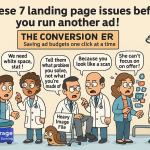
Take a look at this diagram to understand why Landing Pages are so important for small audiences.

“I don’t know… what you are saying is making sense but I always assumed Landing Pages mainly got leads instead of pushing sales.” My client had a last doubt.
There it was on cue, the fifth popular myth about Landing Pages.
Myth 5: Landing pages are only for lead generation
Many assume landing pages are just for collecting emails, not direct sales or other goals.
Fact: Landing pages are designed to drive sales.
In actuality, they can drive purchases, event sign-ups, or app downloads and generate leads making them versatile for brands like Glam.
Take a look at everything that a Landing Page could do:

“Okay, okay, sold! We will have a special Landing Page for this. But when can we have the landing page ready? We need to launch soon, you know.” The client was worried.
I smiled. Small, petty wins are what makes a content writer’s day better.
“I need a day”. I said.
I was lying or in professional parlance, buying time. I only needed two hours. I had a plan,
Follow these steps to see how I wrote the Landing Page in two hours and how you can do the same!
A step-by-step guide to writing a Landing Page
Creating a landing page for Glam is all about turning curious visitors into loyal customers. These steps are all that are needed to get one up and running in no time.
Step 1: Defining the goal and audience
I needed to start by clarifying the Landing Page’s single goal and the audience.
For Glam, the goal is to drive sales of the new Matte Shade collection.
The target audience is young, urban, trend-conscious women (18–35) who value bold, affordable, and cruelty-free makeup.
How to do It:
- I had to write both the goal and audience down first , e.g., “Sell 100 units of Glam’s Matte Shade Collection in one month.”
- Then I had to create a buyer persona, for instance: “Priya, 25, urban office-goer, loves experimenting with vibrant lip colors, shops on Instagram, seeks cruelty-free products under ₹1,000.” This part was not difficult as I had been working with Glam for a while and I knew my TG (Target Group) was urban women under 30 years of age.
- Then I had to craft the content to match the brand’s vibe, keeping it fun, confident, and aspirational.
Step 2: I had to choose a simple landing page builder
The next step was selecting a no-code platform to build the page quickly.
How to do It:
- I would use tools like Canva Websites, Unicorn Platform, or ConvertFlow, which offer drag-and-drop interfaces and beauty-focused templates.
- All I had to do was pick a template with a clean layout, bold visuals, and space for product images (e.g., a “beauty product” or “e-commerce” template).
- The design had to be mobile-responsive, as 80% of Glam’s audience likely browses on smartphones.
Step 3: I had to craft a compelling headline and subheadline
Now I needed to write a headline that grabs attention and a subheadline that explains the value, focusing on the Matte shade’s unique selling proposition (USP).
How to do it:
- Headline: I had to keep it short, within 10-12 words, as the word limit for the page was low in itself. The headline is the first thing visitors see, and 80% of users won’t read beyond it if it’s not engaging. So the headline had to be emotional, engaging, and benefit-focused. Example: “Unleash Your Bold with Glam’s Matte Mood Lipsticks!”
- Subheadline: I had to add clarity and value here. Example: “Cruelty-free, vibrant shades delivered to your door in 3 days.”
- I used power words like “bold,” “vibrant,” or “flawless” to evoke excitement while steering clear of bleh generic terms like “best.”
- Next, I had to optimize the Landing Page for voice search by including conversational phrases and answering common questions e.g., “Where can I buy cruelty-free lipsticks in India?”
Step 4: I had to design a visually stunning hero section
The hero section of a landing page is the prominent visual area at the top of the page that immediately grabs a visitor’s attention. So I had to create a banner for this section with a high-quality image and a clear CTA to draw visitors in.
How to do it:
- Image: I had to use professional product shots for this one or a lifestyle shot of a woman applying a bold shade.
- Color palette: The color palette had to be vibrant (e.g., crimson, plum) for makeup branding, paired with muted tones (e.g., blush pink) for balance. Match Glam’s brand colors.
- CTA button: The CTA button had to ideally contrast with the background color (e.g., bright coral on a white background).
The text had to be minimal in the hero section: one headline, one subheadline, and one CTA.
Step 5: I had to write persuasive, concise copy
The next step was all about creating the copy for the page. The copy had to be concise but conversational, highlighting benefits, addressing pain points, and guiding visitors to act, using a conversational tone.
The AIDCA model was much more suitable for copy that had to be both concise and compelling, it arrested attention, generated interest, kindled desire, inspired conviction and drove action.
How to do it:
- Structure: This structure had five parts – attention, interest, desire, conviction, and action.
Here’s how it came together.

Here are some other mandates for this section:
- Paragraphs had to be short (2–3 sentences) and the copy under 300 words for readability.
- I also had to avoid feature-heavy copy and craft the copy on benefits, e.g., instead of a simple “12-hour wear,” I had to say “Stay flawless from morning meetings to late-night plans.”
Step 6: I had to generate trust
I had discussed this briefly in the previous section. Let me elaborate here. In this stage, I had to include social proof and credibility markers to build trust. This was essential for small brands.
How to do it:
- Testimonials: I had to add 2–3 short customer quotes, e.g., “Glam’s Ruby Red is my go-to for every outfit! – Ananya, 27.”
- Or reviews: I could display star ratings or a stat like “4.8/5 from 200+ happy customers.”
- Badges: I also had to highlight USPs like “Cruelty-Free,” “Made in India,” or “Dermatologist-Approved” with icons.
Remember, the trust elements had to be placed near the CTA to reassure hesitant buyers.
Step 7: I had to optimize for mobile and SEO
Once I had the template and copy ready I had to ensure the page was mobile-friendly and optimized for search engines by testing it on various devices.
How to do it:
- Mobile optimization:
I had to:
- use a responsive template that adjusts to all devices.
- keep CTAs thumb-friendly (large buttons, centered).
- test load speed. This should ideally be under 3 seconds.
- SEO optimization:
SEO was the next checkpoint
- To boost the SEO I had to add keywords like “cruelty-free lipstick India” or “matte lipstick for Indian skin” in the headline, subheadings, and meta description.
- I also had to write a meta title (60 characters) and description (160 characters) with keywords, e.g., “Buy Glam Matte Lipsticks | Cruelty-Free, ₹599.”
- The last step in optimization was to preview the page on both mobile and desktop to ensure readability.
Step 8: I had to include a strong, repeated CTA
I needed to place multiple CTAs throughout the page to encourage action without overwhelming visitors.
How to do it:
- I had to use 2–3 CTAs with different texts throughout the length of the page. One in the hero section, one mid-page, and one at the bottom.”
- Some CTAs had to have urgency or incentives, e.g., “Limited Stock – Order by Midnight for Free Shipping!” or “Sign Up for 10% Off Your First Purchase.”
- And I had to ensure that the buttons were bold, contrasting, and linked to a checkout page or lead form.
Step 9: Test and refine
This was the last step. After I launched the page I had to continuously track performance, and make improvements based on data to maximize conversions.
How to do it:
- I planned on using analytics tools like Google Analytics or the builder’s built-in metrics to track:
- Conversion rate
- Bounce rate (target below 40%).
- The click-through rate on CTAs.
- The A/B tests had to be done on one element at a time, e.g., testing two headlines (“Unleash Your Bold” vs. “Slay with Glam Lipsticks”) or two CTA colors (coral vs. red).
- Then I had to use heat maps (via tools like Hotjar) to see where users click or scroll.
- And I had to keep changing and updating copy or visuals every 3–4 weeks based on performance.
And then it was done. I had a Landing Page up and running in three hours.
The A/B testing would of course go on for a few more weeks but for all practical purposes, the Landing Page for Glam’s Matte Shade was done!
Conclusion
Crafting a landing page for Glam’s Matte Shade collection not only helped me debunk all five major myths about Landing Pages but also helped us sell out the new product in mere days.
I have shown you what are the misconceptions that keep people from using Landing Pages and the reality behind them and I have also shown you how to build a Landing Page super quick in some easy steps.
From proving it’s affordable and simple for small brands to showcasing its versatility beyond lead generation, the truth empowered Glam to launch it’s new shade with confidence.
By leveraging free tools building a Landing Page was a simple task, and only took a few hours. You have the data, you have the know-hiw and the insights, so what are you waiting for? Go dispel the myths and build some path breaking, client winning Landing Pages.
FAQs
1. I’m a content writer, not a designer. Can I still build a good landing page on my own?
Answer:
Absolutely. You don’t need design skills—you need clarity, structure, and a clean template. Use drag-and-drop builders like Carrd, Dorik, or Webflow templates, and focus on the core formula:
Hook → Value → Proof → CTA.
Good writing trumps fancy design when speed is key.
2. What’s the fastest way to decide what to put on the landing page?
Answer:
Ask these 3 questions:
- What’s the one promise this page makes?
- Who’s it talking to (one clear persona)?
- What’s the one action I want them to take?
Once you have answers, plug them into a simple structure. This avoids fluff and keeps you focused.
3. Which free tools can I use to build landing pages without paying upfront?
Answer:
- Carrd.co – Free for 1-page sites with beautiful templates (₹0)
- Dorik (Free plan) – Clean design, includes 1 free site
- Tilda.cc (Free tier) – Great for visual layouts
- ConvertKit (Free tier) – Works well if you want email signups
If you’re just testing ideas or showcasing copy skills—these are perfect.
4. Can I use ChatGPT or AI to help me build a landing page faster?
Answer:
Yes—AI is your creative co-writer. Ask ChatGPT to:
- Generate headlines from your USPs
- Summarize product features into benefits
- Write variations of your CTAs
- Create A/B test copy for your hero section
You bring the insight, AI brings the speed.
5. Are there any AI tools that actually build landing pages—not just write copy?
Answer:
Yes! Tools like:
- Mixo.io – Describe your idea, and it generates a landing page with design + copy
- Durable.co – Great for service businesses (also writes basic text)
- Unbounce Smart Copy + Builder – AI-assisted layout and content
These are fast, though you’ll still need to tweak for Indian context, tone, and credibility.
6. How do I write a landing page for an Indian audience that doesn’t feel “foreign”?
Answer:
Use words and references your audience uses. “Sign up now” becomes “Get started in 2 minutes.”
Avoid overly Western examples or cold-sounding CTAs. Include local proof, WhatsApp buttons, regional testimonials, and keep language simple, not corporate.
7. How do I create urgency or FOMO without being manipulative?
Answer:
Use contextual urgency:
- “Only 50 seats left for the May batch” (specific + real)
- “Early bird pricing ends Friday” (deadline-based)
Don’t fake scarcity. Indian audiences are jugaadu and will spot bluff offers. Be real.
8. What’s a smart workaround if I don’t want to buy a domain right away?
Answer:
Use tools like Carrd, Notion, or Webflow’s free subdomains (e.g., yourname.carrd.co). Or create a Notion landing page with Super or Potion to give it a pro feel. You can upgrade to a custom domain later—start lean, test fast.
9. What landing page copy structure works best when you only have a day?
Answer:
Use the 5S formula:
- S1: Setup – Clear, specific headline
- S2: Struggle – What problem does the user face?
- S3: Solution – What’s your promise?
- S4: Social Proof – Testimonials, logos, results
- S5: Step to Act – One clean CTA (Buy, Apply, Book)
Write it in bullet blocks, not big paragraphs—keeps it scannable and easy to publish.
10. Should I bother with SEO for a quick landing page?
Answer:
Not initially. A quick landing page is for ads, emails, or DMs—where you already have traffic. But if the page is sticking around, add basic SEO:
- Unique H1
- Keyword in meta title
- Alt text for images
Fast load time (Google loves speed)
That’s enough for now.

 Allow notifications