This blog explores how too much choice can kill conversions, offering examples and psychology-backed principles to prevent this. It is a valuable read for content writers, marketers, strategists, and start-up owners who want to boost sales and avoid audience paralysis.
Table of Contents
Introduction: exploding the myth: more choices = more power
If you are an Indian, you must have attended grand Indian weddings with fabulous feasts.
Do you remember the dessert section with 120 sweet dishes from Rabri to Tiramisu and how you could not choose anything? Do you also remember returning to your table with the sad and familiar plate of Gulab Jamun while cursing your indecisiveness?
The fault is not yours. This is a common psychological phenomenon, too many options kill choices.
The same thing happens to brands. You must have seen it before, even without knowing what it was.
Let’s say, you are building a landing page for your new lipstick brand. You are proud of the 48 gorgeous shades you’ve crafted. So you list them all. After all, more choice means more control, more personalization… right?
Wrong.
A customer scrolls through the options, mentally exhausted after comparing Scarlet Sunrise to Blushing Coral to Berry Bombshell endlessly.
Then she does the one thing you didn’t expect: she leaves.
Not because your product isn’t good. But because her brain shut down.
This isn’t a copywriting mistake. This is a psychological mistake.
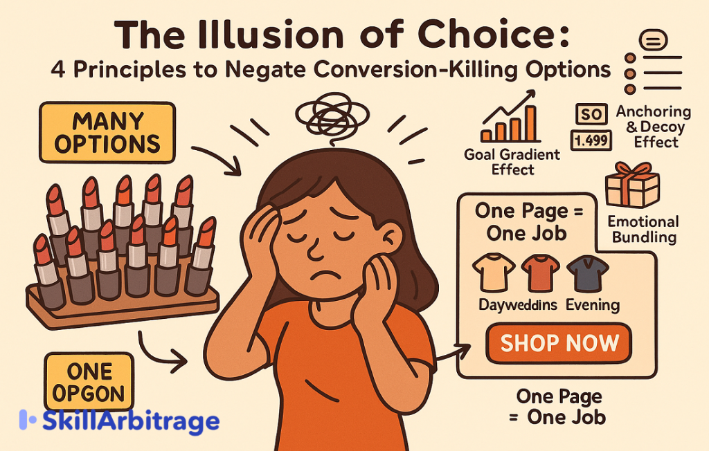
Science has a name for it: the Paradox of Choice. In this blog, I will tell you about the four failsafe conversion techniques that can rescue your content from falling into this paradox.
But first, let us understand what the Paradox of Choice is.
The psychology: when too much = too little
Coined by psychologist Barry Schwartz, the Paradox of Choice describes a mental phenomenon:
The more choices we have, the less likely we are to make a decision.
Why?

Because our brain sees each option as a task. Every additional choice increases cognitive load. We start worrying about picking the wrong thing. And instead of feeling empowered, we feel stuck.
In one of the most cited studies in marketing psychology researchers set up a jam-tasting booth in a supermarket.
One day, the booth offered 24 jam options, another day, just 6.
Here’s the kicker: While 60% of people stopped by the 24-jam booth, only 3% bought something. But at the 6-jam booth, 30% of the people bought a tub of jam.
That’s a 10x jump in conversions—by offering fewer choices.
Here’s a graph to show exactly how huge the difference in conversion was.

The more options were provided, the more people were confused and unable to buy. The crippling lack of decisiveness has a name, “Decision fatigue.”
Unlike what most people believe, it is not marketing jargon, but something that might eliminate all your conversions.
Decision fatigue is real—and a conversion killer
When your landing page offers: 7 CTA buttons, 15 pricing tiers, 30 filter options, 12 testimonials, and 6 headlines — it’s not “feature-rich.” It’s mentally exhausting.
The user doesn’t feel smart. They feel stupid. And worse, they feel like they’re being made to do the hard work.
In digital psychology, this is called decision fatigue, and its impact is terrible.

Think about your own Netflix nights. When you can’t decide what to watch, how often do you end up watching nothing?
Indian digital users are especially vulnerable to choice overload from every direction, from food delivery apps offering more and more discounts to multiple digital payment options at every purchase. And it’s not just B2C.
A B2B SaaS brand offering 12 pricing tiers with nested features will bleed out leads if the prospect can’t quickly self-select.
But this is fixable! Follow this simple rule.
Rule: One page, one job
When a landing page tries to do everything, it ends up doing nothing.
Your landing page should have one job. That job should be:
- Book a call
- Claim a free trial
- Buy a product
- Download a lead magnet
Not all of the above.
A clear CTA should always be unmissable, singular, and simple. To make it easier, let me provide you with some examples.
Comparing good and bad CTA stacks
We are generally told that a direct CTA is a good CTA. But that is not the case. A CTA that does not provide clarity does not convert. Look at these examples.
Bad CTA stack:
- “Start a free trial”
- “Talk to an expert”
- “Download brochure”
- “Buy now”
Good CTA stack:
- Main: “Start free trial”
- Soft: “Talk to us before you begin” (secondary button, below fold)
Now let’s compare the good CTAs with the bad CTAs and see why the second performs better than the first.

But let’s say your landing page currently has a lot of options, can you rescue it and turn it into a lead magnet?
Yes, there are four principles you can follow to get rid of decision fatigue in the audience.
How to negate decision fatigue with copy
Let’s fight psychology with psychology.
These real-world inspired examples will help you see how small optimizations in choice architecture can radically improve conversions. We’re not just rewriting copy—we’re rewriting mental workload.
Let’s take some examples we see every day and understand the triggers we can use to improve conversions.
Example 1: D2C skincare brand
Problem:
The homepage showcases 11 nearly identical serums with names like “GlowGenix,” “SkinFuel,” and “HydraDew+.” Filters include skin type (5), concern (7), and age group (4). Each product has three CTA buttons: “Buy Now,” “Learn More,” and “Add to Wishlist.”
This feels comprehensive but overwhelms users.
They click “Learn More” repeatedly, increasing time on site but not conversions—a classic case of decision fatigue.
Solution:
Use chunking, a psychological principle built on the principle that working memory handles 3–5 items. The homepage now features three products with clear labels:
- Best for Acne-Prone Skin
- Best for Dry Skin
- Best Anti-Aging Serum
A single CTA, “Shop Now,” replaces multiple buttons. Filters and additional options appear after the user clicks, reducing initial cognitive load.
Why It Works:
Clear labels answer “Is this for me?” acting as cognitive shortcuts (heuristics). A single CTA simplifies the decision, making the brain feel confident, not confused.
Example 2: EdTech coaching funnel
Problem:
A popular Indian test prep brand’s landing page for its UPSC course features a muted CTA in the hero section: “See Curriculum.” Below, it includes 15 testimonials, three embedded YouTube videos, six bonus eBooks, and scattered CTAs: “Book Free Class,” “Download Syllabus,” “Get Consultation,” and “Watch Demo.”
This feels like a crowded coaching center with multiple distractions. The primary goal, booking a class, is buried, leading users to abandon the page due to analysis paralysis.
Solution:
Apply the Goal Gradient Effect, where a short, clear action path boosts motivation. The revised landing page focuses on one goal:
- Headline: “Crack UPSC in 12 Months — Join Our Proven Program”
- Single CTA: “Book Free Class Now” (high-contrast button)
- Testimonials limited to three top achievers
- Additional materials (e.g., demo video, eBooks) appear after the user clicks the CTA providing clarity and action.
Why It Works:
The clear headline and single CTA guide users directly to booking, reducing cognitive overload. Testimonials build credibility without clutter, and deferred content keeps the decision simple.
Example 3: Indian SaaS CRM brand
Problem:
The CRM’s pricing page offers eight tiers: “Starter,” “Advanced Starter,” “Team,” “Growth+,” “Scale,” “Enterprise,” and two custom tiers, each with checkboxes for 20+ features (e.g., integrations, APIs, storage). Buttons include “Buy Now,” “Request Demo,” and “See Feature List.”
This complexity confuses even seasoned marketers. Multiple similar options and competing CTAs fragment attention, causing decision paralysis.
Solution:
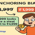
Use Anchoring and the Decoy Effect to make the mid-tier option appealing. The revised pricing page offers three tiers:
- Starter (₹0)
- Growth (₹499/mo) — tagged as “Most Popular”
- Scale (₹1,499/mo)
Key benefits are summarized in 3–5 bullets per tier, not exhaustive checklists. A single CTA, “Start with Growth Plan,” dominates the page.
Why It Works:
The “Most Popular” tag leverages social proof, nudging users toward the Growth plan. Simplified tiers and benefits reduce cognitive load, while the mid-tier feels like the best value compared to the extremes (Decoy Pricing).
Example 4: D2C Lipstick Brand
Problem:
The homepage displays 48 lipstick shades with names like “Mauve Mania,” “Dusty Rose,” and “Flame Fuchsia.” Filters include shade family, skin undertone, finish (matte, gloss, satin), price, and popularity. Each shade has a CTA: “Add to Cart.”
This overwhelms users, who admire colors and appreciate the range but don’t purchase due to a lack of emotional anchors and excessive filter steps.
Solution:
Apply emotional use-case bundling to reduce decision complexity. The homepage now showcases six lipsticks in three categories:
- Best Daywear Nudes
- Top Picks for Indian Weddings
- Bold Evening Shades
A single CTA, “Try These 6 Now,” leads to a 30-second shade quiz that recommends a personalized shade after the user engages.
Why It Works:
Use-case-based categories (e.g., “Indian Weddings”) resonate emotionally, especially with Indian consumers. The low-stakes CTA and deferred quiz simplify the initial decision, encouraging action over indecision.
You don’t drive your conversions lower by lessening choices, you drive them higher.
The audience has to understand what you are offering them, what are the benefits/functionality and what they need to do, that’s all.
If these criteria are met then they will click.
Did you find this interesting? Why not try it out on your next landing page and let me know how it went in the comments?
Conclusion
Your landing page isn’t a catalog. It’s a conversation. And every extra option is noise in that conversation.
Simplicity isn’t about dumbing things down. It’s about smart design. It’s about guiding the user’s eye, calming their brain, and helping them feel confident in their decision.
Whether you’re selling lipsticks or SaaS, test prep, or skincare, remember: a confused user doesn’t convert, a focused user does.
So strip away the clutter. Say no to 12 CTAs, 30 filters, and 8 pricing tiers. Say yes to one clear action, one irresistible value prop, and one frictionless path.
Because in digital marketing, the best choice you can give your customer—
is the power not to choose… just act.
And that’s how simplicity sells.
FAQs
Q: My landing page has multiple buyer personas—how do I apply “one page, one job” without losing segments?
A: Don’t force one page to do everything. Instead, split your traffic at the entry point. Use a segmentation quiz, category selector, or toggle (“I’m a student” vs. “I’m a working professional”) on the hero section. Once users self-identify, drive them to hyper-targeted landing pages—each with one job tailored to that persona. This lets you personalize without overwhelming.
Q: We have a complex SaaS product. How can we reduce decision fatigue without over-simplifying and underselling?
A: Use progressive disclosure. Instead of listing every feature upfront, show just 3–5 key outcomes or benefits on the main page. Add expandable sections, tabs, or a feature comparison toggle for users who want depth after they’ve committed interest. This keeps the decision tree shallow on first glance, but robust underneath—respecting both casual browsers and serious evaluators.
Q: Is reducing options always the best move? What if my brand’s USP is range and variety—like in fashion or cosmetics?
A: Reducing visible options doesn’t mean removing them. Use curated bundles, “shop by occasion”, or shade quizzes to group variety into digestible, emotionally resonant clusters. Variety feels empowering only when paired with clarity. Think of it like Netflix’s “Top Picks for You” instead of throwing the entire catalog at the viewer.
Q: How do I convince my stakeholders that removing CTAs or filters won’t lower sales? They think more options = more conversion.
A: Share data-backed case studies (like the jam experiment or SaaS pricing decoy effect from the blog) in your stakeholder presentation. Better yet, A/B test both versions—your “feature-rich” original vs. a streamlined version. Show them real performance metrics: bounce rate, scroll depth, and most importantly, conversion lift. Let results silence assumptions.
Q: We’ve already built a bloated landing page—do we need to scrap everything to fix it?
A: Not at all. You can apply a “choice audit” using these steps:
- Identify the primary conversion goal.
- Reorder elements to prioritize this goal (above the fold, high contrast CTA).
- Consolidate or hide secondary CTAs below the fold or behind tabs.
- Group similar options (e.g., pricing, products) using chunking or badges like “Best for X.”
- Add friction only after the user clicks—never before.


 Allow notifications