This blog will help you spot and fix the exact issues that are silently killing your landing page conversions, so you can stop wasting ad money and start turning clicks into sales.
Table of Contents
Introduction
So you’ve created the perfect offer. You’ve spent hours preparing ad campaigns, writing copy, designing creatives, and setting everything up. But when you finally run the ads, and traffic starts coming in, you realise there’s no conversion.
People click, they go to the landing page, scroll, and then… they leave. No signups. No purchases. All you get left with is just a high cost-per-click and tons of confusion.
And the worst part is, you can’t figure out what’s actually going wrong. The ads are getting clicks, your product/service is solid, and everything should be working. But it isn’t. And every single day, you’re spending money on ads that bring in visitors but don’t bring in sales.
If you’ve ever faced this, let me tell you, you’re not alone. This happens to even the most experienced marketers and creators, and 90% of the time, the issue is not in the product, not with the traffic, but with the landing page.
Landing pages can silently kill your sales if just a few key elements are even slightly off. But there is absolutely no reason to worry about that because most of these issues are easy to fix once you spot them.
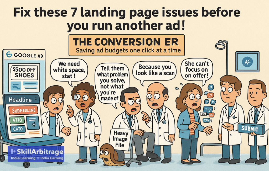
So in this blog, I’m going to show you 8 critical landing page issues you need to fix before you run another ad. Because until you fix these, you’re just throwing money at a page that’s not going to convert.
But first, you must understand what are the implications of having a bad landing page.
What happens when you have a bad landing page?
Most people think a bad landing page would just bring them fewer sales, but that’s not true. A bad landing page is actually much worse than that. It will not just waste your potential and leave money on the table, but it will also slow you down. And guess what happens then?
Your competitors get the sales that are deserved by you. Leads won’t even get to know about the features or your quality. This is why you need to understand the implications of what happens when your landing page is bad. Here are a few of those reasons:
- When people land on the page but close it immediately, it pushes your cost per click (CPC) of ads higher making it more and more expensive to run ads.
- When people visit your website but don’t buy anything, then that will make your conversion rate lower. This means you are wasting your leads.
- When serious buyers visit a bad landing page that looks confusing, cheap or risky, they start losing trust. They start thinking your offer also might be low quality. This hurts your sales and harms your credibility.
- When the first impression is bad, you’ll have to work 10 times harder to convince them later. All your follow-up calls or emails will start to look desperate, which will make closing the sale much harder.
- When nothing is converting, you start doubting your own offer. You begin thinking something’s wrong with what you’re selling even when the real problem is just how it’s presented.
- When your offer isn’t clear, people won’t even know what they’re saying “no” to. If the page doesn’t explain the value fast, they’ll just exit. You’re not getting rejected but they just never understood what you were offering.
- When your message doesn’t feel urgent, people will delay. Even if they’re interested, they’ll put the decision on hold. And in sales, when someone delays, they usually don’t come back to buy.
- When your landing page looks outdated, people think your product is outdated too. If your design looks old, messy, or homemade, they’ll assume your offer is also low quality, even if it’s actually great.

That is the real damage a bad landing page causes. It doesn’t just slow your sales but it also kills your trust, burns your ad budget, and makes even serious buyers walk away. But the good part? Every single one of these problems can be fixed.
You don’t need to change your product. You just need to fix the way you present it. So now let’s break down the 8 biggest landing page issues that are silently killing your conversions and how to fix each one before you run another ad.
1. Match what they came for, not what you want to show
A big mistake that most people make is that they say something else in the ad and show something else in the landing page. See, your landing page is not a poster. It’s a continuation of the conversation you started in your ad.
That means the first thing your landing page should do is match the intent of what the visitor clicked for. Because people don’t have time to figure things out. If your page doesn’t immediately feel like the right place, they will click back, and you’ll have paid for nothing.
Let me explain this to you with examples. Suppose someone clicks on your ad that says, “Top Mixer Grinders Under ₹5000.” They land on your page, and the first thing they see is a ₹7999 model. What will happen? They’ll feel cheated and click back. You lost them.
Or, suppose your ad says “Energy Efficient Ceiling Fans,” but your landing page starts by talking about design and colors. Again, a mismatch that will frustrate the lead away.

This is the reason why most landing pages fail,it’s not because the product is bad or the design isn’t pretty, but because the message breaks the flow. It’s not just about design. It’s about alignment. So, how to make sure you have matched the intent?
a. Give them what they came for
Start your landing page with exactly what they came for. Meaning what they would expect after seeing the ad. The specific feature that you promoted in the ad makes it the hero of your landing page. For example: If they clicked for budget-friendly TVs, highlight lower priced TVs on the main page.
b. Use the same keywords
Start by using the same words or phrases they saw in the ad. The headline, subheadline, or first section of your landing page should repeat the same keywords you used in the ad. Why? Because that’s what made them click, so when people see the same phrase again, it makes them feel like they’re in the right place. For example: If your ad said “energy-efficient fans,” don’t change it to “eco cooling solutions” on the page.
c. Repeat the promise
Start your landing page by repeating the promise you made in the ad. Don’t assume they’ll remember the ad because they won’t. People have very little attention span these days. So if your ad said “No-cost EMI available,” mention that again on the page. If it says “Delivered in 24 hours,” make sure that’s one of the first things they see.

So remember that your landing page isn’t where the journey starts but where the decision happens. So if you break the flow between the ad and the page, you’ll lose people before they even read your offer.
Now that the intent is clear, it’s time to fix the second most common mistake most people make, because of which the page confuses the buyer, even when the messaging is right.
2. Keep the hero section clean & focused
The hero section is the first thing people see when they land on your page. What do we call the hero section? It is the part of the screen visible before they start to scroll. In simple words, the first page that’s visible when someone visits your landing page.
The hero section is no less than gold if correctly built because if your visitor gets confused there, they won’t even care to scroll down. They won’t care to explore. They’ll just leave.
Consider it as your 5-second pitch. If you mess it up, the rest of your page won’t matter because they’ll never read it. That’s why your hero section needs to do only one thing which is to grab attention and make it clear what you’re offering.
a. Headline
Start the hero page with the headline which is clearly saying what the product is and what makes it special. Don’t try making it poetic or something clever as that will simply make the visitor confused.
For example: “High-Speed Mixer Grinder With 3 Jars, Perfect for Daily Indian Cooking.” This will make people immediately understand what you’re offering and who it’s for.
b. Benefits
Now add 2-3 short benefits right below the headline. Make sure you don’t write long paragraphs or give too much explanation. Just mention the core reasons why someone should buy. For example:
• Crushes ice and tough masalas in seconds
• Free home delivery within 2 days
• Only ₹3,999 (Limited stock)
This would give the visitor a reason to stay on the page and continue reading.
c. Visuals
Show a strong visual of the product right at the top. Use a high-quality image or a short demo video that shows the product in action. Don’t use random stock photos, and don’t make people scroll just to see what the product looks like.
A real, clear visual will build instant trust and make your offer feel more believable. It also helps people imagine the product in their lives, which increases the chances of conversion.
d. CTA
Use one clear CTA and make it obvious so that it clearly tells the visitor exactly what to do next, whether it’s “Buy Now,” “Book a Free Call,” or “Watch a Demo.” But don’t give too many options.
Just pick one clear action and place it right below the benefits or product image. If you give multiple CTAs, people get confused. They pause, overthink, and most of the time, they just leave.

So until now, your hero section would start doing its job. But just making them stay is not enough. Because even after staying, people won’t just buy, even if you mention all the features in the world. They will buy when they understand how it helps them.
3. Talk about what it does, not just what it has
Most of you must be reading this while sitting in a chair. Did you buy that chair because it has “ergonomic lumbar support,” or did you buy it because “ergonomic lumbar support prevents back pain, keeping you comfortable even after hours of sitting”?
Of course, because it ensures better posture and long-term comfort. You have to do the same thing with your landing page. Instead of simply mentioning what the product has, mention what it does for the customer.
a. List the features
Start by writing down all the important features that your product offers. This will tell you what the product does, using which you will be explaining why the customer should care about that feature.
For example: Suppose there is a product that is an earphone. Then the feature of that product will be – “Active noise cancellation technology.”
b. Why should the customer care about the feature?
Now that you have listed the key features, it’s time to ask yourself, how would that feature help the customer, meaning “Why should the customer care about this feature?”
The answer you get is going to be how your product will solve customer’s problems and improve their lives.
For example: The feature that we listed was “Active noise cancellation technology,” so now we need to understand why the customer should care about this feature. The answer will be “Because it blocks out background noise.”
c. Customer focused
Now you get the benefits from the features. It’s time you need to phrase that benefit in a way that clearly highlights how it will improve the customer’s life, because that’s what customers want to hear, and that’s what basically the product does.
For example: The benefit we had was “Active noise cancellation technology,” so we could rephrase it like, “Enjoy your music or work in complete peace, no matter how noisy your surroundings are.”

I hope you understand now that every feature that your product has, also has a benefit attached to it, and you just need to phrase that benefit in a more persuasive, relatable, and effective way so that customers find the product attractive.
But till now, there’s no reason why people should trust that whatever you showed is true. This is a major problem to solve because they cannot verify the product digitally before ordering. Solving for trust could give a big boost to your landing page.
4. Solve for trust
People don’t land on your page and start trusting you instantly. That’s not how the internet works anymore. Everyone is skeptical by default, especially when they’re seeing your brand or product for the first time.
So if you want them to buy, you have to actively build trust. And not through fancy words, but through proof. Here’s exactly how to do it:
- People trust other people more than a landing page. So start showing star ratings (4 or above) below the product title or near the CTA. If you don’t have a 4+ rating, then simply add 2-3 short, real customer reviews that will at least make new visitors feel like they’re not the first to try it.
- If your product has been featured anywhere in media like TV, newspaper, magazine, or even a popular YouTube channel, then mention it clearly. Just a small line like “As seen on NDTV” or a few media logos can make a big difference. It shows that someone credible has already talked about you, and that instantly increases trust.
- If your product has any official certifications like BEE star rating, BIS mark, ISO, or FDA approval, then show them clearly as badges or icons on the page. Don’t just claim it’s “high quality.” Back it up with proof through these certifications or badges. These symbols tell people that your product meets a trusted standard and has been tested for safety or performance. That builds confidence fast.
- If you offer returns, free exchanges, warranty, or a money-back guarantee, say it clearly near the price or CTA. Don’t make people hunt for it in the footer. Most people are scared of getting stuck with a bad product. Your guarantee should make them feel safe and confident to buy, knowing they can change their mind if needed.

So now start going through your page and ask this question, “If I were seeing this for the first time, would I trust it?” If not, add real reviews, certifications, recognitions, and clear guarantees. Don’t leave trust to chance; fix it yourself.
But the problem is that none of this matters until people don’t even see it. The problem that new businesses ignore is landing page optimization. That hurts them more than they could imagine.
5. Optimisation
See, no matter how good your landing page is, if it is slow or clunky on mobile, nothing else matters. You could have the best offer, the best design, and the best ad, but if your page takes more than 3 seconds to load, people will skip. That’s just how today’s traffic behaves.

And the part that most people don’t realise is that at least 63% of your visitors are opening your page on a mobile device. That means your landing page is not a desktop page, but it’s a mobile page first. So here’s what you need to make sure of:
- People on mobile don’t wait as they have unlimited dopamine at a few fingertips away. So, make sure your landing page loads in under 2 seconds. If it takes 2 seconds or more, you’ve already lost half your visitors. Speed is not optional; instead, it’s the first thing that decides whether someone will even stay to see your offer.
- Don’t just test your landing page on fast Wi-Fi, but test it on mobile data too. Most people in tier 2 and tier 3 cities browse on 3G or 4G. So, open your page using mobile data and see how it actually performs.
- Avoid fancy animations and autoplay videos on your landing page. They might look cool, but they slow things down and make the page buggy, especially on low-end phones. Autoplay videos also eat up data, which can annoy users and make them leave. Focus on speed and clarity, not effects that only look good but hurt performance.
- Don’t assume your page looks perfect just because it works on your phone. Open your landing page on Chrome, Safari, Edge, and Firefox because every browser behaves differently. Something that looks fine on one browser might be broken or misaligned on another. If you don’t check, you might be losing a lot of your audience without even knowing it.

Now, go ahead and run your landing page through speed testing tools. Open it on multiple phones. Check it on different networks and browsers. Then fix what’s broken or slow. Because in a mobile-first world, speed is not a bonus instead it’s survival.
However, along with this, one thing that you need to keep in mind is that a landing page is not your website. It is a landing page. So don’t turn it into a website. Let me explain more.
6. Minimise distractions
You need to understand that a landing page is not your website. It’s not meant to let people explore, browse, or wander around. It’s meant for one single task that is to make them take one specific action, which is to buy, sign up, book a call, or download something. That’s it.
But most people mess this up by treating their landing page like a homepage. They add menus, links, footers, and a dozen buttons that do nothing but give the user more ways to leave without converting.
This is because distraction usually kills conversion. Every extra element steals attention from the one thing you want them to do. When you remove distractions, the path becomes clear for the lead, and action becomes easier. Here’s what you need to fix:
- If your landing page has links like “Home,” “About,” or “Contact Us” at the top, remove them. These links act like exit doors and let people click away before they take action. A landing page should have only one goal, so don’t distract them with other options.
- Don’t add too many links in the footer thinking it makes your page look complete or professional. Unless it’s legally required like Terms and Conditions or Privacy Policy, remove all. When visitors scroll to the bottom and see too many options, they get distracted and lose focus from the main action you want them to take.
- Don’t confuse people by giving them too many things to do. If your goal is to sell a product, don’t also ask them to join your newsletter or follow you on Instagram. Stick to one clear CTA. When you give multiple options, people either get distracted or end up doing nothing at all. One page. One purpose. One action.

Start going through your landing page and remove anything that doesn’t push the visitor toward the main CTA. Keep it focused. Keep it tight. Because a landing page that tries to do everything ends up converting nothing.
Now, the final thing you need to do is to fix the main purpose for which your landing page was created. The call to action.
7. The Call to Action (CTA)
Once you’ve grabbed their attention, built trust, and shown the value of your offer, there’s one main thing that actually turns a visitor into a customer, which is a strong, clear CTA.
Your CTA (Call to Action) is the button or link that tells the user what to do next. And if it’s weak, hidden, or confusing, your entire landing page will fail. Why?
Because a clear and timely CTA reduces friction, guides people step-by-step, and removes hesitation. Without a strong CTA, even the best landing page will end with “maybe later” instead of action. So here’s how to get the CTA right:
a. Make it stand out
You need to make your CTA button clearly visible to the eyes of the leads. You can do that by using a bold color that stands out but still fits your brand. Don’t let it blend into the background or look like just another button.
The visitor should immediately know where to click without thinking twice. If they have to search for it, you’ve already lost them. For example: If your page has a white background, use a strong color like orange, blue, or green for the CTA.
b. Use clear, actionable language
Don’t use vague words like “Submit” or “Click Here” that mean nothing. Your button should tell the visitor exactly what they’re going to get after clicking.
This will remove confusion and make the next step obvious. When people know what’s on the other side, they feel more confident to click. For example: “Click here to start your free trial.”
c. Repeat the CTA
You need to repeat your CTA at least 2-3 times across the landing page. Don’t just place it once at the top and expect people to scroll all the way back when they’re ready to take action.
Add the same CTA again after every major section, especially after explaining key benefits. That’s when the visitor is most interested, and that’s exactly when you should remind them what to do next.

Go through your page and check if your CTA is easy to spot, written in action-focused language, and repeated at the right points. If not, fix it. Because a strong CTA isn’t just the end of your page but it’s the whole point of it.
Conclusion
I hope you see now that most landing pages don’t fail because the product is bad. They fail because they confuse people, distract them, or simply don’t give them a reason to trust and take action.
And if you’ve been pouring money into ads but not getting conversions, the problem is likely not your ads but your landing page. But now that you know what to fix, you won’t face that problem again.
Because next time you run an ad, you won’t just send traffic and hope it works. You’ll send traffic to a page that’s fast, focused, and built to convert. That’s how you stop wasting money and start seeing real results.
So go fix these 7 things and make sure your next visitor actually becomes your next customer. I will be happy to know how well it worked for you.
Frequently asked questions
- Do I need a separate landing page for every ad campaign?
Yes, ideally. Each ad campaign speaks to a different angle, problem, or audience. So if you send all your traffic to the same generic page, the message won’t match. Create different landing pages that match the exact promise or hook of each ad, it’s a bit more effort but your conversions will thank you.
- How do I know if my landing page is actually working?
The best way is to track conversion rate out of 100 people who visit, how many take action? If you’re converting less than 2%, it’s a sign something still needs fixing.
- How long should my landing page be?
As long as needed to make someone take action, but no longer. If it’s a low-ticket product, 1-2 scrolls are enough. For high-ticket or service-based offers, you may need longer pages to build trust. But avoid fluff. If a section isn’t convincing someone to buy, cut it.
- Should I use pop-ups or not?
Use them carefully. If they interrupt the user too early, they are annoyed. But if timed right, like exit-intent or after some scroll, then they can boost conversions. Just make sure the pop-up adds value (like a bonus or reminder), not pressure.
- What if I don’t have any customer reviews yet?
Use your own story. Talk about how you built the product, what problem it solves, and why it exists. Authenticity builds trust. Also, try giving early access to a few people for free in exchange for honest reviews.

 Allow notifications