In this article, I am going to educate business owners and marketing professionals on CTAs by using a step-by-step method that they can follow to make better CTAs and increase their conversions.
Table of Contents
Introduction
In my first online venture, I had created a perfect website and promoted it with perfect ads which consistently brought a good number of visitors to my website but still none of them were buying.
My website, content and ads looked better than my competitors but still I was behind them and had no idea what the reason was why people took action with them but not with me.
This was a very difficult business situation to fall in, and soon I realised the mistake that I was doing. It was not having a call to action that is powerful enough to make people take action.
For those of you who have literally no idea, a call to action (CTA) is like a bridge between interest and action. It motivates interested people to take action.
This is what a CTA looks like. The buttons that you see at the bottom of the below screenshot are a CTA. It guides people on what they should do next after reading the details on the website. 👇

Sounds simple? Trust me, it’s not. Every business owner thinks they have a good CTA until they follow our steps and see their conversions multiply.
Whether your CTA is not performing as nicely as you want it to, or you don’t even know how to make a CTA – Every problem will start to disappear as you read till the end.
Let’s start!
What makes a CTA good or bad?
If you also want to have a powerful CTA, the first step is to learn about what a good CTA even is.
There are 3 main aspects that you must have in your CTA that makes it irresistible:
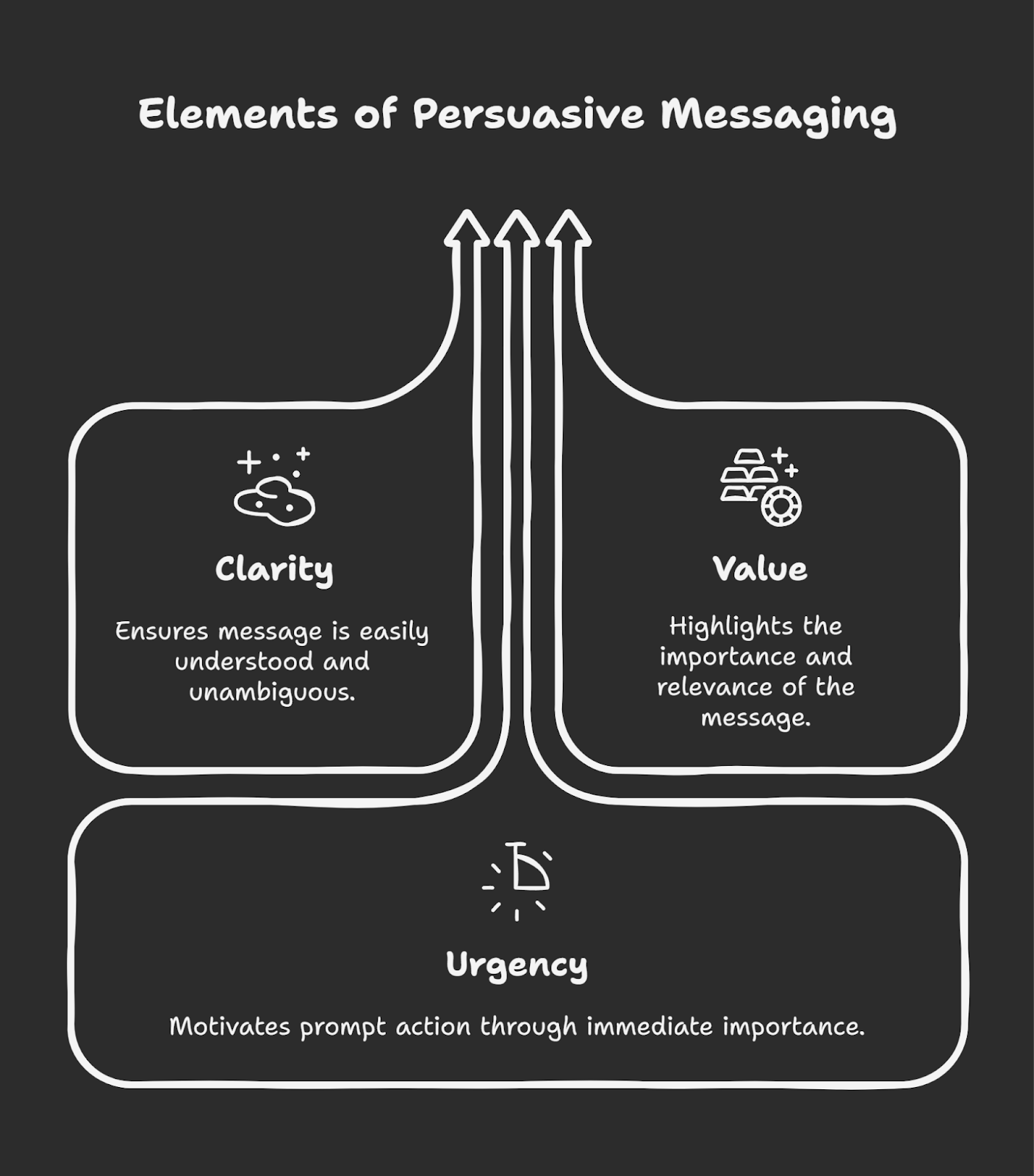
Clarity – THIS IS EXACTLY WHAT YOU WILL GET!
What I learned with a lot of trial and error is that people won’t click on your CTA if you don’t directly tell them exactly what will happen once they click.
This is why you will always notice that a good CTA directly tells what will happen or where they’ll be taken once the audience clicks. It’ll not let the audience have second thoughts, instead it’ll immediately remove confusion and make the next step obvious.
Here’s an example that’ll show you what clarity looks like in a CTA:
Suppose you have a CTA saying “Click here”. It doesn’t tell what will happen after clicking. But if you change it to “Click here to download a free guide”, it immediately tells the audience a guide will be downloaded.
Value – IT’S FOR YOUR BENEFIT!
From the previous aspect, people know what will happen once they click. Now you need to also tell them WHY they should click. What’s in it for them and why they should care about your CTA. You need to give them the reason.

And that reason needs to be something they care about. It must feel attractive to them, and the easiest way to make it attractive is to give value. If the audience feels that they’re getting something of their advantage for free, they will click.
Suppose your CTA says, “Click here to download a free guide”. Here, there is no info on how the guide will help you. Or even if there’ll be info, it doesn’t answer why the audience should care. Your CTA should directly convey the benefit.
A better CTA will be “Click here to download a free guide that’ll help you lose weight,” as this directly tells the audience what benefit they will receive through the guide after clicking. This will bring more action than the previous vague CTA.
Urgency – TAKE IT NOW OR YOU’LL NEVER GET IT AGAIN!
If you’ve ever noticed students in a school, most of them don’t study until the exam date is close. This tells a lot about human psychology. Most people, when they feel they can do something later, chances are, they choose to do it later, and then later won’t do it at all.
This is why I notice that every CTA that performs well, always has a sense of urgency in it. It always, in some way pushes people to take action instantly instead of postponing it for later.
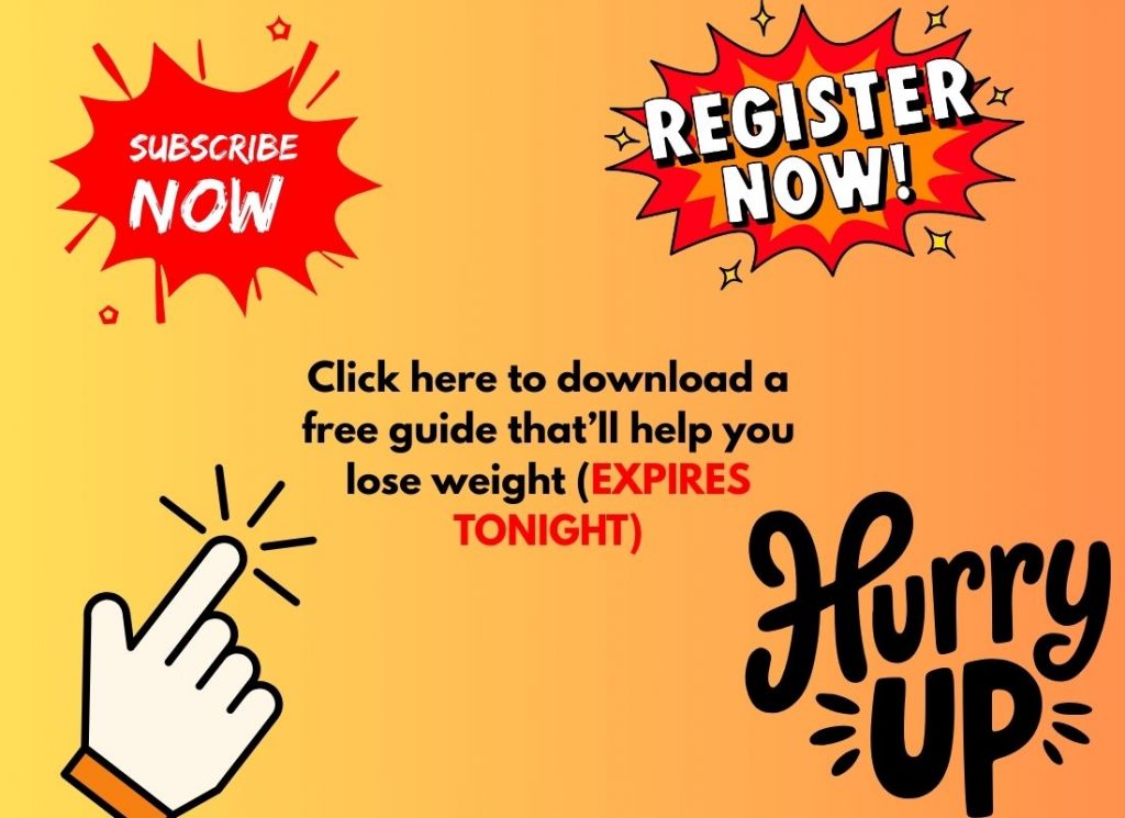
For example, a CTA saying “Click here to download a free guide that’ll help you lose weight” could make readers think they can do it later, after which they may forget and never return.
A better CTA like “Click here to download a free guide that’ll help you lose weight (expires tonight)” warns them they can miss out if they don’t act fast.
You need to make sure that your CTA has all three of these aspects because even if you don’t have just one, the conversions will decrease significantly.
Now you know what must stay in your CTA, the real question is, how will you incorporate it for your own specific business?
A step-by-step method to create a powerful CTA
Most people think creating a CTA takes hours of time and effort, but that’s not true. Using my knowledge and a little bit of practice, you can create a CTA in under 10 minutes.
So, are you ready to spend 10 minutes of your time if those 10 minutes can give you a boost in conversions? If yes, let’s start by understanding your audience so that you can set a goal for your CTA.
Why? Because you need to know for whom & why you are creating the CTA, else how will your CTA be relevant to the audience?

Step 1: Understand your audience to set a goal for the CTA
- Interests, pain points & motivations
You need to start by knowing the interests, pain points and motivations of your target audience so that you can offer them exactly that in order to make them take action.
To know the interests, pain points and motivations of your audience, simply ask yourself “Who am I speaking to & what are their needs?”.
For example: If you have a business that helps young professionals get a new job by upskilling themselves, and your website offers them a course to upskill.
Their interests will obviously be in getting career growth.
Their pain point could be that they are confused or have no idea about what they actually need to do to achieve career growth.
Finally motivation? That could be a higher salary.
Now, we will use this information to craft a CTA that will be irresistible for them not to click.
A CTA if you have not taken this step: Click here to learn and upskill yourself.
A CTA after you understood the audience: Upskill Today & Earn More – Enroll Now!
Consider yourself as the audience then ask yourself which one of these will you click.
- Stay focused on a single goal
The next step to follow is to focus only on one goal at a time. Having multiple goals works nowhere, not in life and neither a CTA.
Keeping just 1 goal in a CTA will make sure there’s as little friction as possible in the process and increase your conversion rates by 161%.

The goal you should always keep in your mind is to never increase friction in the process because if you give multiple options to a customer, they overthink and in the process of overthinking, decide to not even click.
We should reduce the friction and make the process so smooth that the audience doesn’t even realise what happened and ends up taking action.
For example: A bad CTA is “Subscribe & save 20% – Also get a free guide” which tries to fulfill two goals at once: getting sales and pushing a download. A better CTA will be just “Subscribe now & get 20% off”, which has a single goal (to drive sales).
Now you understand your audience and also have an idea of how to frame your CTA according to the persona of the audience. But how to write the CTA in order to make it completely irresistible? That will be done by choosing the right words in the right place.
Step 2: Use language that inspires action
If you ask people to take action, they will have to ‘think’ before taking action. Instead of asking people, tell them exactly what they need to do by using action words at the beginning of your CTA. Let me give you a small action-words blueprint:
- For initiating purchases, you can use action words like Buy, Shop, Claim, Get, Order
- For sign-ups, you can use words like Subscribe, Join, Start, Try, Download
- For increasing engagement, you can use Share, Comment, Discover, Learn, Watch
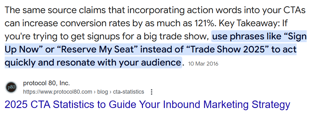
These were just a few of the action words but you are free to use any action verbs that you like, just make sure that it makes the CTA exciting because this alone could increase conversion rates by up to 121%.
For better understanding, let me show you a weak CTA and a strong CTA side-by-side so that you feel the difference that an action verb makes:
- A weak CTA: Our guide has great tips.
The above CTA does not have an action word in the beginning which is why there’s nothing pushing the audience to click. This CTA is trying to give a guide so let’s add an action-oriented verb in the beginning.
A strong CTA: Download our free guide which has great tips!
So what is the main thing you learned? It is to always start your CTA with a strong action-oriented verb. But do you think this alone will make your CTA powerful? I doubt it. What if the audience simply thinks he will take the action later?
This is a problem you don’t need to worry about because it can be solved if you create a sense of urgency in the minds of your audience immediately after they read the CTA.
Step 3: Add a sense of urgency
Not using urgency can make the audience think, “I will do it later”, and chances are, they’ll never do it. When people feel they have unlimited time to decide on doing something, they will utilize the advantage of that unlimited time and keep postponing their decision.
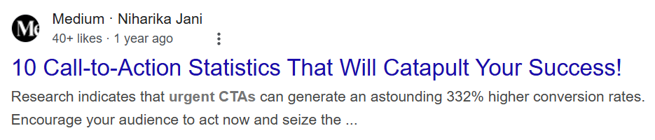
That’s why we need to bring a clear deadline, which makes them feel if they don’t take action immediately, they may lose the opportunity to take that action forever. This alone could literally boost your conversion rate by 332%.
Now, let me tell you how you can bring a sense of urgency in your CTA. Simply add a time limit before everyone has to take action as after the time limit, it will expire. Make sure you keep the time limit not more than 48 hours.
Here’s an example of how a CTA changes when you add a deadline: Suppose your old CTA is “Limited-Time Offer”. It does not force the audience to take action instantly as there’s no definite expiry time.
But if you change it to “Offer Ends at Midnight Tonight!”, it clearly tells that the audience won’t be able to take action after midnight, so they should do it right now.
This method to add urgency is good for businesses where it’s possible to add a specific time limit. But what about businesses where it’s not possible to add a time limit?
Those businesses can mention that they cannot serve everyone and that only a few more customers can be taken.
For example: Sign up before we close – Only 3 spots left!
But still some businesses won’t be able to use any of the above methods to create urgency. Should those companies miss out on creating urgency in their CTA? Definitely not.
What all other businesses could do is to add a social angle to the CTA making everybody else feel FOMO (Fear of missing out) for not taking action. They can give a sense that everyone else is taking action, and only you are left behind.
This example will make it clear to you: Join 50,000+ Happy Customers – Get Yours Now!
These kinds of social angles also create a sense of urgency because social proof often gives people confidence that if everyone else is doing this, then there must not be anything wrong with it. Hence, they tend to take action quickly.
Step 4: Highlight the value using benefits and not features
The mistake was that I used to mention features, when instead, I should have mentioned the benefits of taking action.
This is a feature: 128 GB storage
This is a benefit: 128 GB storage so you don’t stress about where to store your memories.
Now that you understand the mistake I made, which most of you still do, here’s exactly how you can turn features into benefits for your CTA:
- Find the value
First, start with understanding which pain of the customer your product or service solves. Solving that pain is what you will mention in the CTA as a value.
For example: Your product is software that helps people with their pain in automating day-to-day tasks, so the value you will highlight in your CTA is that it can help them easily automate day-to-day tasks.
- Benefits > Features
Rephrase the value in the form of benefits instead of features as explained earlier. If you face a problem while rephrasing, simply think about ‘why the feature of the product matters’.
For example: The feature of your software is, “It can automate day-to-day tasks”. It is a feature because that is what the software offers to do.
Now, we have to think about why someone would need that software. The answer you get is the ‘benefit’ of the product – “Save time by automating your tasks”. That’s what we will mention in the CTA as providing value.
Here’s an example of how this value could be incorporated into a CTA – Download Now and Save 5 Hours a Week by Automating Your Daily Tasks!
Are you also thinking the same? This CTA includes everything – goal, action, urgency, and value, but still, this is not a CTA that might get enough clicks. So everything that I told you till now, was it a lie?
Of course not. Here comes the final stage to creating the CTA – Keep it short & simple.
Step 5: Keep it short & simple
You must keep your CTA as short and simple as possible, and here’s how you can turn a long CTA short and simple:
- Divide your long CTA and break it down into the main action that you want your audience to take and the value they will be getting.
For example: If your long CTA is “Download Now and Save 5 Hours a Week by Automating Your Daily Tasks!” then divide it into:
Main action: Download Now
Benefit: Save 5 hours a week
Extra details: Automating daily tasks
- Once divided, remove the extra details and try creating a CTA with just the main benefit and action.
In this case, “Automating Your Daily Tasks!” can be removed, and your CTA will look like “Download Now and Save 5 Hours a Week”.
- Finally, restructure the CTA in a way that it becomes short and direct. A simple way to do it is to add a “-” hyphen in between or add “And”. In most cases, a hyphen (-) works better.
For example: “Download Now and Save 5 Hours a Week” will become “Save 5 Hours a Week – Download Now!”.
- After your CTA has been made short and simple, finally verify it by asking yourself these two questions:
- Does it take more than 3 seconds to read? If your answer is yes then shorten the CTA even more.
- Would I click on this immediately? If you think you won’t then bring more action or value in the CTA.
And this is how you can create your own perfect CTA which will motivate the audience to click and boost your conversions exponentially.
However, there is one more aspect left. Not specifically with the CTA, but where the CTA should be placed. Because if nobody will notice your CTA, nobody will click.
Step 6: Make it stand out visually
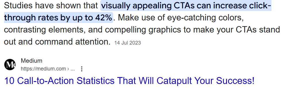
- The first thing that will make the CTA noticeable will be its color. Choose a color for your CTA that contrasts sharply with the background color. Here are some tips for choosing colors:

- Go with a high-contrast color compared to the background. For example: A deep blue button on a light yellow background.
- Make sure it’s not dull or it fades into the page else it won’t look distinct and visible. For example: Grey, beige, or pastel tones.
- Then make the text inside the CTA button also contrast with the button color and background at the same time. This way, all three of them must contrast with each other to be impossible to ignore. For example: White text on a dark blue button.
- After choosing the right colors, you need to adjust the size of your CTA so that it is easily clickable, yet not very big that it spoils the whole page. Here are some tips for you to understand the perfect size:
- Have buttons with texts that are at least 1.20X as big as the surrounding text.
- Make the button so wide that it’s easily clickable even on mobile devices.
- Keep small padding on all sides of the button so that people know it’s a button when they click or hover on it.
- Keep the area around the CTA empty so that it gets the full attention of the viewer.
- Make sure the button is at least 48×48 pixels, which is Google’s recommended touch target size.
- You can also add small design tricks like cues to guide audience towards the CTA. Here are some tricks for you to consider:
- Use arrows that point towards the CTA to make it the focus.
- Add a slight drop shadow to make the button look more “clickable”.
- Try a small animation to draw attention to the button like a gentle pulse effect.
- Use icons like a shopping cart or download icon to make the CTA more engaging (This will also help you make the CTA shorter).
Tracking your CTA’s performance
Creating and placing your CTA isn’t enough. You also need to track how well it’s performing.
Why?
Because if you don’t track it, you’ll never know what’s working and what’s not. Also, you’ll keep losing opportunities to optimize and boost your results.
How exactly can you track your CTAs? It’s simple. Use tools that are already available and easy to implement like Google Analytics, UTM parameters, and heatmap tools like Hotjar or Crazy Egg. Let me explain how you can use each clearly:
- Google Analytics:
You can easily track how many clicks each of your CTA buttons gets by enabling Event Tracking in Google Analytics. This lets you see the exact number of clicks each CTA receives.
But you’ll probably need a coder or someone familiar with JavaScript to set this up on your website. Ask your developer to add a small snippet of tracking code that fires an event every time someone clicks your CTA.
After this is done, you can simply open your Analytics dashboard and navigate to Behavior → Events → Overview to see your CTA performance.
- UTM Parameters:
This one is simpler and doesn’t need coding skills. You just need to add unique tracking links to each CTA. Use any free “Campaign URL Builder” tool online and create different UTM links for every CTA you make.
Here’s how it looks practically:
yoursite.com/offer?utm_source=homepage&utm_medium=button&utm_campaign=freeguide
In this URL, can you see the last part of the text after “utm”? That’s how your CTA link will look after adding UTM parameters. Your audience will never know, and you can easily track the performance of each CTA.
- Heatmap Tools (Hotjar, Crazy Egg):
Lastly, heatmaps show exactly where your visitors click, scroll, and spend their time. Tools like Hotjar or Crazy Egg visually show you how effective your CTA placements are.
Sign up for any heatmap tool, install a small script (your coder can do this in a few minutes), and you’ll start getting visual data instantly.
With these tracking methods, you’ll clearly know what your audience responds to the most, helping you continuously improve your CTAs for even better conversions.
Conclusion
By reading the guide and following the steps, you would have understood that creating a powerful CTA doesn’t take 10-20 hrs and a team of copyrighters. But it only takes a little bit of creativity.
Improving your CTA is the best move you can make right now in your business as it is known to bring exponential growth time and time again. So, go ahead and implement these steps to have a CTA that is impossible to resist clicking.
Frequently Asked Questions (FAQs)
- How many CTAs should I have on a single page?
In my experience, 1 CTA per page is the best because going anything above that simply confuses the audience regarding where to click first.
- Can I use humor in my CTAs?
Yes you can use humor in your CTA if it also aligns with your brand image, else it will just make it look unprofessional. For example: Adding humor to a depression-related page will not look professional.
- Do emojis in CTAs increase engagement?
There is no such rule about whether emojis help or not because it depends on your brand image particularly. If you still want to use emojis, test it first using just 1 per CTA.
- Should I avoid using too many exclamation marks?
You should avoid using more than 1 exclamation mark on your CTA else your CTA will simply give an impression that you are too needy.
- Do CTAs work in offline marketing as well?
Absolutely! CTAs aren’t limited to just websites or digital ads, they’re equally powerful offline. Think about the signs outside a shop saying, “Sale ends tonight!” or a restaurant handing out flyers saying, “Bring this flyer for 20% off your first order!“.
- Do different industries need different CTA strategies, or is it one-size-fits-all?
While the core principles of clarity, urgency, and value apply universally, the exact words, tone, and approach might change depending on your industry. For example, a B2B tech company will have a more professional, benefit-driven CTA (“Book Your Demo Now”), whereas an online clothing store might use a more casual, urgency-driven CTA (“Grab your favorite dress. Limited Stock!”).


 Allow notifications