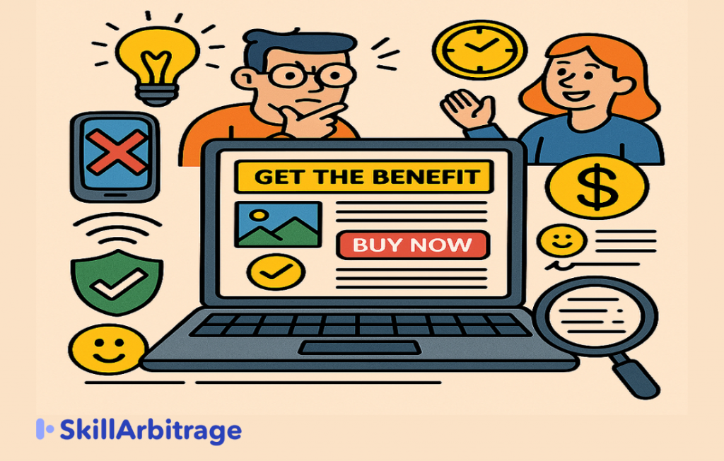
This blog will give you a simple but powerful checklist to review before you publish any sales page, so that you don’t lose money or lead over small mistakes that are easy to avoid. This blog is helpful for marketers who design landing pages.
Introduction
You’ve built the offer. You’ve designed the page. You’ve written the copy. You’re just about to hit publish. But somewhere deep inside, there’s that tiny doubt in you that says, “What if I missed something?”
I’ve seen this happen to way too many business owners and marketers. They rush to launch the page, thinking everything’s in place, only to realise later that something small, like a broken link, unclear CTA, or missing mobile optimization, killed the conversions.
And trust me, when a sales page flops, it’s rarely because the offer is bad; it’s usually because one small issue ruined the first impression, confused the visitor, or failed to build enough trust. You won’t even realise what went wrong until money is already burned and leads are already lost.
That’s why I created this blog, so that you don’t have to rely on hope. So that you don’t leave your launch to luck. And so that you can confidently publish your sales page knowing it’s tight, sharp, and ready to convert, but first, you need to understand the implications of not checking your sales page before publishing.
What happens if you publish a sales page without checking properly?
Most people think that a few minor mistakes won’t matter if their product is great. They say things like, “People who really want it will buy anyway,” or, “It’s just a small issue, no one will even notice.” But let me warn you with the truth.
Small issues on your sales page don’t stay small. They go on to silently kill sales, burn your ad budget, and destroy trust faster than you realise.
Publishing a sales page without carefully checking it first is akin to sending your visitors to a shop with a broken entrance, no lights, and missing price tags.
Even if the products inside are amazing, people won’t go in because the experience feels confusing, frustrating, or downright shady. Here’s exactly what happens when you skip thorough checks before publishing your sales page:
- Broken CTAs (Call-To-Action): Imagine someone is convinced by your offer, excited to buy, and ready to click. But the moment they tap “Buy Now,” nothing happens, or an error shows up.
Here, you didn’t just lose one sale; you lost every person who faces the same issue. And once that happens, they lose confidence and rarely return to give you a second chance because they don’t want to waste their time.
This also affects your credibility as a quality business because, if your sales page is perceived as low-quality, then chances are the quality of your product or service is also perceived as low.
- Slow mobile load speeds: More than 60% of your visitors access your page on a smartphone, often with slower mobile data connections. If your page takes more than 2–3 seconds to load, you’ve already lost half your potential buyers.

People today don’t wait because they have unlimited dopamine one click away, so they will simply close your page and buy from a faster competitor instead.
- Confused messaging: When your sales copy is unclear, your visitors will start to feel confused. And the reality is, a confused visitor doesn’t message you asking for clarification; instead, they prefer to just leave.
This way, your carefully crafted offer will get ignored, not because it’s bad, but simply because it wasn’t clearly communicated.
- Poor conversion rates: Even small mistakes, such as unclear headlines, messy formatting, or distracting visuals, can drastically lower your conversions.
If your sales page doesn’t clearly show visitors exactly what they should do next, they simply won’t do it. Every small hurdle makes it harder for people to convert, resulting in fewer sales despite great traffic.
- High bounce rates: If people land on your sales page and immediately exit without interacting, your bounce rate increases. For those who don’t know, the Bounce rate is the percentage of website visitors who leave after viewing without taking any action.
Higher bounce rates aren’t just a meaningless number instead, they directly increase your ad cost and signal to platforms like Google and Facebook that your page isn’t relevant, further reducing your reach and increasing your ad spend.
- Lost trust & credibility: Trust is everything online. If visitors notice typos, broken buttons, inconsistent design, or sloppy formatting, they start questioning everything else, like your offer, product quality, and business credibility.
Even if your offer is exceptional, these small mistakes make visitors feel uncertain, and uncertainty can kill sales faster than anything else. As, nobody wants to take the risk of buying something crappy online.

- Wasted Ad money: You pay for every click your ad gets. But if your landing page is broken, confusing, or slow, you’re paying money to send visitors directly to your competitor’s arms.
Each visitor who doesn’t convert because of page errors is literally money burned, making your ads more expensive and far less profitable. Not only that, but now your competitors will target them with ads and steal them from you.
- Damage to brand reputation: Your sales page isn’t just about making immediate sales, but it’s also about shaping how people perceive your brand long-term.
When visitors repeatedly experience bad or frustrating pages, they start associating your entire business with low quality, carelessness, or unreliability. Fixing a damaged reputation is far more costly and difficult than fixing a sales page upfront.
- Increased customer support load: Every issue on your sales page translates into customer confusion and frustration, which turns into countless emails, DMs, and phone calls.
This unnecessarily increases your customer support workload, consuming your time, resources, and energy that could have been spent making more sales or improving your offer instead.
- Lower SEO rankings: Google loves clean, fast, and high-converting pages. Pages with high bounce rates, poor user experiences, or slow loading speeds tend to rank lower in search results.
This means you lose out on valuable free organic traffic, forcing you to rely even more heavily on paid ads.

I hope you now clearly see why skipping final checks is such a huge mistake. It doesn’t just slow down sales, instead, it actively hurts your business and damages your reputation.
But the good news is that all of these problems can be avoided with just a simple yet thorough checklist. Let me show you the exact checklist that will help ensure your sales page is perfect before you ever hit the “publish” button.
Checklist 1: Does the headline grab attention & promise a clear benefit?
Your headline is going to be the first thing that visitors will see when they see your sales page and make the decision of whether they are interested in reading further or not.
So this is going to be the most important part of your sales page because nothing else matters if visitors get disinterested at first glance. Your headline should fulfill two things instantly:
- Grab their attention
- Promise them a clear and specific benefit
If it grabs the attention beautifully, then you can be sure that the visitor is reading the headline. And then, when you promise them a clear, specific benefit, you make sure they are interested in reading the sales page further.
If even one of these gets messed up, your entire sales page will get ignored. So, how can you make sure your headline is up to the mark? Here’s how:
- Specific & Outcome driven
Ask yourself, “Is this headline specific and outcome-driven?” Because if it were, then it would feel more believable and valuable. Vague lines that don’t say anything specific sound like just hype, while specific outcome-driven lines sound like results.
For example, a bad headline would be “Get Fit Fast”, while a good headline would be “Lose 5 Kilos in 30 Days Without Going to the Gym”. The bad headline is neither specific nor does it promise anything, and that is why it’ll fail.
- What’s in it for them?
Ask yourself, “Does this headline answer what’s in it for me?” Because that’s exactly what your reader is thinking. They’re not here to admire your creativity. They’re here to fix a problem, get a result, or improve something in their life.
If a complete stranger landed on your page for the first time, would they instantly understand what they’re getting out of it just by reading the headline? If not, it’s not working.
- Stop them from scrolling
Ask yourself, “Is this bold enough to stop someone mid-scroll?” Because that’s exactly what needs to happen first. Most people are scrolling fast, so they’re half-distracted and half-looking for something useful.
If your headline doesn’t snap them out of it, they’ll miss everything else on your page. To make it scroll-stopping, do three things:
- Keep it short, under 12 words works best
- Use power words
- Hit a desire or a pain point
Because when someone sees a headline that speaks directly to what they want (or what they’re tired of struggling with), they pause. And that pause is your window to convert.
The point is that you should not treat your headline like some formality because it is your hook. If it fails, then everything else fails and doesn’t even get a chance to work. Spend time on the headline and ensure it conveys value from the very first second.

Checklist 2: Does the subheadline support the hook and add context?
Once someone reads your headline and becomes interested, their eyes naturally move to the next line, which is the subheadline. And that’s your second big chance. Because now they’re asking, “Okay, what exactly is this about?” And if your subheadline answers that properly, they stay.
Your job here is to give them context without sounding repetitive. Think of it like the headline got their attention, and now the subheadline will convince them to stick around. Here’s how to make that happen:
- Does it explain the headline without repeating it?
A lot of people mess this up by saying the same thing twice in different words, once in the headline and then in the sub-headline. That just wastes space. Instead, ask yourself, “Can I add a layer in the subheading?”
You can simply explain how the offer works, or what it includes, or why it’s different. That extra detail in the sub-headline helps the reader feel confident that this page is actually worth their time.
Here’s how a good pair looks:
Headline: “Master Freelancing in 30 Days Without Any Prior Experience”
Subheadline: “Learn how to find clients, set rates, and start earning online even if you’ve never worked a gig before.”
- Does it build curiosity or urgency?
You want your subheadline to create a little pull. Something that makes the reader think, “Okay… now I want to see what’s next.” You can do that by hinting at value without giving everything away. Use lines like:
- “Here’s what most people get wrong…”
- “And why does this method work when others don’t.”
- “But you need to act before this changes…”
The idea is to trigger a feeling, either excitement or FOMO. That’s what keeps them scrolling.
- Can someone read it in 2 seconds and get it?
No one wants to read a mini-paragraph. So keep your subheadline short, clean, and super easy to read. Aim for 1–2 lines max. Use simple, everyday words. Avoid fancy jargon or clever phrases.
If a schoolkid wouldn’t get it on the first try, rewrite it. Clarity beats creativity every single time.
See, if your headline is the hook, the subheadline is what holds them. That’s the moment you earn their attention. Or lose it. So don’t treat this like filler text.
Use your subheadline to give context, spark interest, and make the reader feel, “Yes, I want to see more.” That’s when they stay. And that’s when you can finally sell.

Checklist 3: Is the Above-the-Fold section doing the heavy lifting?
The above-the-fold section is the first thing someone sees before they scroll. For those who don’t know, it means the section just before someone starts scrolling.
That means this is your first impression. And in most cases, your only shot. Because, just like you, your visitors are quick to judge.
If they don’t get what the page is about or why it matters in the first 3 seconds, they’ll bounce. So this part of your page has one job, which is to carry the weight. It should instantly answer three things:
- What is this?
- Why should I care?
- What should I do next?
Let me tell you how you can get it done for your sales page:
- Is the offer crystal clear at a glance?
Don’t make people guess. No one should have to read five lines or scroll even a little to understand what you’re offering. Within seconds, the visitor should be able to say, “Okay, this is a course on X” or “This tool helps me do Y faster.”
Your headline and subheadline should make that obvious right away with no jargon, no hype, and just clear value.
- Is there a visual that makes it feel real?
Humans process visuals before they process text. So you need an image that instantly supports what you’re selling.
If it’s a course, show the instructor or a dashboard sneak peek. If it’s a product, show it in use. If it’s a service, show the outcome someone gets from it.
The right image builds trust without needing words and makes the offer feel tangible.
- Can someone see the CTA without scrolling?
If someone is ready to buy in the first 5 seconds, don’t make them hunt for the button. Your CTA should be right there, above the fold. Put it near the headline and use a bold color that stands out. The easier you make it to act, the higher your conversions go.
- Is there one small thing that builds trust?
Even the best offer needs a trust booster. Just a small signal that says, “This is real.” You can use:
- A quick testimonial with a photo
- A stat like “Trusted by 5,000+ users”
- Your brand or media logos
- A security badge if it involves payments
One simple trust element is enough to reduce doubt in those crucial first seconds.
See, you can have the best content below, like testimonials, features, bonuses, everything, but if your top section fails to engage, most people will never see the rest.
This is your elevator pitch. It should tell them what this is, why it’s worth their time, and how to get started, all within seconds. Nail this section, and you’ve already done half the work.

Checklist 4: Does your messaging speak directly to your ideal customer?
If your page tries to talk to everyone, it ends up converting no one. Because the moment your perfect buyer lands on the page, they should immediately think, “Wait… this is exactly about me.”
That emotional connection is what makes people trust, stay, and make a purchase. Here’s how you make sure your words feel like a personal conversation with your ideal customer:
- Is your tone matching your audience’s mindset?
Your tone should feel exactly like the conversation your reader expects. Ask yourself:
- Are they beginners who need extra reassurance? If yes, then keep it simple, casual, and supportive.
- Are they busy, serious professionals? If yes, then be clear, quick, and respectful of their limited time.
- Are they experienced in your niche? If yes, then get more technical, confident, or enthusiastic.
Why does this matter so much? Because if your tone feels too formal for a young audience or too playful for a serious audience, trust instantly drops. And when trust drops, your conversions follow.
- Are you clearly calling out their biggest pains?
What are the main challenges your ideal customer is dealing with that your product or service helps with? You need to address those pains clearly and directly. For example:
- “Tired of applying everywhere and still not landing freelance clients?”
- “Frustrated because your workouts aren’t showing results, despite your best efforts?”
When someone sees their exact issue described clearly, they believe you understand their situation better than anyone else. And if you understand their problem, they assume you also know the solution.
- Have you anticipated and answered their doubts?
Every buyer has hesitations. They’re thinking things like:
- “Will this really work for someone like me?”
- “I’ve already tried before, what if I fail again?”
- “Is it actually worth the price?”
Your job is to mention these doubts yourself, then calmly answer them right there on the page. You can do this through your main copy, testimonials, or a short FAQ.
Finally, ask yourself, “If your ideal customer reads this, would they feel seen?” This is your final check. After reading your page, your target buyer should feel like, “This is exactly what I’ve been looking for.”
If they don’t feel seen, go back and rewrite as if you’re speaking directly to just them. Use their exact words, highlight the problems they face daily, and clearly show that you truly “get it.”
This matters because people don’t buy when they’re impressed by your offer. They buy when they feel understood.
The real goal of targeted messaging is not just to explain your product, but to show that you deeply understand your customer’s life and exactly how your product fits into it. And once someone feels you’re speaking their language, selling becomes effortless.

Checklist 5: Is your offer clear, valuable, and irresistible?
Your offer is the heart of your entire sales page. Everything you write leads up to this moment. So, if the visitor still isn’t clear on what they’ll get or why they should care, they simply won’t buy, no matter how good your headline or visuals are.
Your offer needs to answer these clearly for the visitor:
- “What exactly am I getting?”
- “Why should I care?”
Here’s exactly how you make your offer crystal clear and impossible to ignore:
- Is it absolutely clear what you’re selling?
Don’t make your visitor guess. Clearly spell out what they’re getting. For example:
- If it’s a course, clearly state what it teaches, who it’s meant for, and what results they’ll achieve.
- If it’s a service, explain exactly what you’ll do for them and what outcome they’ll walk away with.
- If it’s a product, describe clearly what it does and exactly how it makes their life better.
Keep your explanation straightforward. If someone reads your offer and still thinks, “Wait, what am I actually getting?” then you need to rewrite it immediately.
- Are your features easy to skim quickly?
Most people scan instead of reading carefully. If your offer looks complicated, they’ll skip it. So format everything neatly with:
- Bullet points
- Short, punchy lines
- Bold or highlighted words
Break down clearly what they’ll get, whether videos, modules, calls, templates, or anything else, so visitors immediately see exactly what’s included at a glance.
- Do your benefits scream value clearly?
Remember that features tell and benefits sell. Don’t just list what’s included; instead, clearly tell them why it matters. For example:
- Wrong: “5 video lessons”
- Right: “5 step-by-step videos to help you land your first paying client within 30 days”
Always connect the feature directly to the transformation. It’s that transformation that makes someone want to buy.
- Do you have bonuses? Clearly highlight them.
Bonuses increase the perceived value of your offer. So if you’re offering extras like:
- Free templates
- 1-on-1 coaching calls
- Private community access
- Limited-time discounts
Clearly highlight them on your page. Make bonuses feel special, not just thrown-in extras. Clearly explain why each bonus is valuable and how it benefits the buyer.
- Do you have a guarantee or risk-reversal?
People naturally hesitate because they think, “What if this doesn’t work for me?” You need to address this doubt directly. Clearly state any guarantees, such as:
- “Try for 7 days; if it’s not for you, get a full refund.”
- “If you don’t see results, you don’t pay.”
Even if you don’t offer refunds, consider using some kind of risk-reducer like a satisfaction promise or dedicated support, because it removes the friction of buying.
Even if someone loves your entire sales page, if your offer isn’t crystal clear, valuable, and low-risk, they still won’t buy.
Your offer is the moment the visitor thinks, “Okay, this is worth it. I’m in.” So make your offer easy to understand, easy to skim, and impossible to ignore. That’s exactly how you turn interest into sales.

Checklist 6: Do you have strong proof elements that build trust?
No matter how good your copy is, people won’t trust you just because you said so. Because your visitors have seen exaggerated claims and false promises before. Now they don’t trust words, they trust evidence. Your only goal here is simple: “Don’t just say it. Show it.”
- Do you have clear, believable testimonials (with photos and names)?
This is the easiest and most powerful form of proof. Show real people who’ve actually gotten results with your product or service.
- Include their real name and photo to make it feel genuine.
- Have them clearly state the problem they had and exactly how your product solved it.
- Don’t over-edit testimonials, as real, honest feedback works far better than polished, scripted praise.
Aim to include at least 3–5 strong testimonials. Place them right after your offer, and space them throughout the page if necessary.
- Can you show clear before-and-after results or case studies?
If you can clearly show a transformation, do it immediately. Numbers and clear results stick in your buyer’s mind. For example:
- “Before: No freelance income. After: ₹50,000/month within 60 days.”
- “Before: 8% email open rate. After: 35% open rate after using our templates.”
Even quick mini-case studies or transformations are powerful, as long as they feel real, believable, and relatable.
- Do you have trust badges, media mentions, or professional credentials?
Small signals like trust badges or certifications help visitors feel safe and confident. Consider using:
- Logos of well-known brands or partners you’ve worked with.
- Certifications or credentials (ISO certified, Google Partner, etc.).
- Media mentions or featured badges (like “Featured in…”).
- Secure payment icons or refund badges.
These subtle details might seem insignificant, but they significantly reduce subconscious doubts.
But what if you don’t have testimonials yet? Not a problem. Don’t leave this section empty. Include something that builds credibility, such as:
- A powerful usage statistic (“Used by 1,200+ creators in 12 countries”).
- A strong refund or satisfaction policy which is clearly explained.
- A quote or short story from your own experience, if it adds credibility.
But never leave the proof section blank. A page with no evidence feels risky, and risky pages simply don’t convert. Trust is the final step that turns visitors into buyers. Proof removes doubts, and when doubts vanish, your visitors become buyers effortlessly.
So, don’t just say your product is great; instead, show them clearly how others have used it, trusted it, and succeeded.

Checklist 7: Have you answered doubts before they’re even asked?
Every sale is a silent negotiation. Even if your reader doesn’t say it out loud, they’re silently thinking things like:
- “Is this actually worth my money?”
- “Will it really work for someone like me?”
- “What if I’ve already tried something similar and failed?”
If your sales page doesn’t clearly address these doubts, they won’t ask; instead, they’ll quietly click away. Your goal here is simple: anticipate every doubt or hesitation that stops them from buying, then calmly address it on the page.
Here are some common objections and how you can handle them, so that you can learn how to handle any other objection that you might get:
- What if they feel your pricing is too expensive?
They might love your offer, but still wonder, “Can I really afford this?” Here’s how you handle pricing objections:
- Clearly compare your price with what they’d otherwise spend (like hiring agencies, trial-and-error methods, or expensive alternatives).
- Break down your offer clearly: “You’re getting ₹15,000 worth of templates, lessons, and coaching for just ₹1,499.”
- Offer flexible payment options, installments, or limited-time discounts (if you can).
Also, remind them clearly of the hidden cost of not taking action because not solving their problem can be even more expensive.
- What if they think they don’t have enough time?
Lack of time is one of the biggest excuses. You need to flip that by clearly showing your offer is designed specifically for busy people:
- “Just 20 minutes a day is enough to complete a lesson.”
- “Specifically built for working professionals so finish at your own pace.”
- “Zero fluff, just practical steps you can immediately implement.”
Your goal is to prove clearly that getting started right now is easier than they think.
- Have you clearly explained why your offer is different (and better)?
Your visitors are constantly comparing your offer to alternatives, consciously or subconsciously. So clearly highlight not just what your offer is, but exactly why it’s better:
- “No theory, just step-by-step actions backed by real examples.”
- “Unlike other programs, you get unlimited 1:1 support.”
- “We don’t just teach; we help you execute.”
When visitors understand clearly why your offer stands apart, buying becomes the obvious next step.
One of the easiest ways to handle objections clearly is to add an FAQ section at the bottom of your sales page. Structure it like this:
- Questions are written exactly as buyers would ask them.
- Clear, direct answers that reassure and remove any hesitation.
Don’t dodge tough questions; instead, address them directly, as it builds trust. Your sales page shouldn’t feel like a sales pitch, but it should feel like a helpful conversation.

Checklist 8: Are your CTAs clear, repeated, and action-oriented?
Your Call-to-Action (CTA) is the most important moment on your entire sales page. Because everything you’ve written leads to this point, that is, getting visitors to take action.
Whether that action is “Buy Now,” “Join the Program,” “Book a Call,” or something else entirely, you have one big problem: Most sales pages hide their CTA, make it weak, or place it only once at the bottom.
If someone’s ready to buy but can’t find the button quickly, you’ve lost that sale. So your CTAs need to be clear, repeated, and impossible to miss. Here’s exactly how you do that:
- Do your CTAs appear multiple times throughout the page?
Never expect visitors to scroll down, get convinced, and then scroll back up to buy. That’s too much work. Instead, clearly add CTA buttons throughout your page, at points like:
- Immediately after the hero section (above-the-fold)
- Right after clearly explaining your offer
- After testimonials or proof sections
- After handling objections or in your FAQ section
Think of your CTAs as exit ramps. Wherever the visitor is on your page, there should always be an easy path to take immediate action.
- Are your CTAs benefit-driven instead of generic?
Generic buttons like “Submit” or “Buy” are boring and cold. Your button copy should clearly state the outcome or benefit visitors get when they click.
For example: A wrong boring CTA would be “Join Now,” while a benefit-driven CTA would be “Start Building Muscle Today.” Always clearly communicate what exciting thing will happen if they click, as it will make them feel eager to take action.
- Does every CTA button lead to the exact same goal?
Your CTAs must always be consistent. If your goal is to sell a product, every button should clearly lead to the same checkout or purchase form.
Don’t confuse visitors with mixed CTAs like “Learn More” in one place and “Join Now” in another, unless they clearly lead to the same action. Confusion kills conversions, so keep your CTA goals crystal clear.
- Is your CTA copy persuasive and clear?
Your button copy should:
- Clearly use action-driven words (“Start,” “Get,” “Join,” “Unlock”)
- Be short, simple, and easy to read (ideally just 2–5 words)
- Create excitement or clarity (“Start Your Free Trial” works much better than generic “Click Here”)
Go through your page exactly like a visitor would, and click every button. Make sure nothing is broken or confusing. Weak CTAs kill great offers. Your CTA is the exact moment when visitors turn into buyers. So make it clear, exciting, and easy to find.
Because when visitors finally decide they’re ready, your button needs to be right there, waiting for them to click. And when they feel understood, there’s simply no reason left for them to say no.

Checklist 9: Are you using urgency and scarcity ethically (not fake)?
Even if visitors are interested, they rarely take immediate action. Why? Because people naturally delay decisions, especially if there’s no clear reason to act right now.
This is why urgency and scarcity matter. They help visitors decide faster, commit sooner, and avoid putting things off “for later” (which usually means never).
But the catch is that it only works when it’s real. Fake urgency or scarcity (like countdown timers that reset or pretend “limited spots”) breaks trust and hurts your brand. Your goal here is authentic urgency that honestly motivates action without ever feeling fake.
- Limited-time offer? Use a timer.
If your special pricing, bonus, or deal genuinely has a deadline, clearly mention it and include a countdown timer. Visual timers remind visitors clearly that time is limited. This turns casual browsers into buyers who know they must act before time runs out.
For example:
- “Offer ends in 3 hours.”
- “Price increases tomorrow at midnight.”
But only use a timer if your deadline is actually real. Fake timers quickly kill trust.
- Limited spots or availability? Clearly mention it.
If your offer has genuine limited availability, like limited coaching slots, limited batch sizes, or limited access, clearly highlight it on your page. For example:
- “Only 15 seats left for this batch.”
- “The next 20 sign-ups get bonus templates.”
Real scarcity clearly gives people a reason to act before missing out.
- Have an upcoming deadline? You have to make it visible.
If you have a known end date for something like closing enrollment or the start date of a program, clearly display that on your sales page.
People need clear reminders. A clearly visible deadline can create far more last-minute conversions than almost anything else.
Remember that if visitors notice your timer resets on page refresh or your “only 3 spots left” claim is fake, they’ll instantly lose trust. And once you lose trust, sales don’t just drop, your reputation does too.
Instead, always clearly explain what’s genuinely limited and exactly why. Authenticity alone creates urgency and builds lasting trust. This step is super important because real urgency clearly transforms “I’ll think about it” into “I’ll do it now.”
However, this only happens when it is done ethically. Use genuine deadlines, real limits, and clear communication, and your sales page will convert more quickly, without ever feeling fake or scammy.

Checklist 10: Is your copy clean, clear, and error-free?
You may have the best offer, the most attractive visuals, and the strongest CTA, but if your copy feels clunky, confusing, or full of errors, your visitors will lose trust immediately.
Your words are what actually sell on your page. So this final step is about making sure your message is sharp, clear, and convincing from start to finish. Here’s exactly what you need to check before hitting publish:
- Have you read it aloud to ensure it flows naturally?
This is the simplest way to catch sentences that seem fine on screen but sound awkward in real life. If you stumble while reading, your readers will likely do the same. Ask yourself clearly:
- “Does this sound natural?”
- “Would I actually speak this way in a real conversation?”
If the answer’s no, rewrite until it sounds human and natural.
- Have you checked carefully for typos, grammar errors, and awkward phrasing?
Even a single spelling mistake can make your entire page feel sloppy and unprofessional. Always run your copy through tools like Grammarly or Hemingway, but also personally proofread it again with fresh eyes.
Small mistakes cause big damage to your credibility, especially when you’re asking people for money.
- Have you clearly removed fluff and tightened every sentence?
Cut anything that doesn’t clearly add value or move the sale forward. This includes filler words, overly complicated explanations, and repeating the same point multiple times. Your audience is busy. Respect their time. For example:
- Wrong: “This course will really help you if you’re someone who’s been trying hard but not seeing results.”
- Right: “If you’ve tried hard without results, this course is built exactly for you.”
Say more with fewer words, as that will make your message clearer and more powerful.
- Does every sentence clearly draw readers in, making them want to say “yes”?
This is the ultimate test. After each paragraph, clearly ask yourself, “Does this help move the reader closer to a decision?” If a sentence or paragraph isn’t clearly pushing interest forward, either rewrite it or remove it entirely.
This matters because a clean copy builds trust. Clear copy drives action. An error-free copy shows attention to detail, reflecting directly on your product’s quality.
So, before hitting publish, always run this final check. It could easily be the difference between visitors scrolling past or becoming your next customer.

Checklist 11: Have you tested for mobile and speed? No excuses.
Most of your traffic will likely come from mobile. So your sales page isn’t just something that also works on mobile, but it needs to be built for mobile first. Because if your page loads slowly, looks broken, or the text is hard to read, visitors won’t wait or zoom in, they’ll just leave.
And no matter how good your offer is, it won’t matter if the experience sucks on their phone. So before you go live, run this checklist to make sure your page loads fast, looks clean, and feels effortless to use on any screen.
- Does the page load in under 3 seconds?
Speed is non-negotiable. Every extra second of load time increases bounce rates. So compress all your images, avoid heavy code or animations, and run your page through tools like Google PageSpeed Insights or GTmetrix.
If it takes more than 3 seconds to open, most users won’t even wait to read your headline.
- Is the CTA clearly visible above the fold?
Just like a desktop, your CTA should appear at the top, without requiring scrolling. Place it just below the headline and make sure it stands out clearly. Don’t let users hunt for it. If someone’s convinced early, they should be able to act immediately.
- Is all text readable without zooming?
If users need to pinch in, scroll sideways, or squint to read, they’ll bounce. Use font sizes that are easy to read on small screens (at least 16px), keep paragraphs short, and make sure there’s enough spacing between lines and sections.
- Are images aligned and not cut off?
Images that appear fine on desktops can look terrible on mobile when they are stretched, cropped, or misaligned. Check every image on different screen sizes, including product photos, testimonials, and icons, to ensure nothing appears broken.
- Are buttons big enough to tap comfortably?
On mobile, people use thumbs, not mouse clicks. Make sure your buttons are at least 44px tall, wide enough, and spaced far enough apart so users don’t accidentally click the wrong thing.
Also, check dropdowns, checkboxes, and forms as they should be easy to tap and fill out without frustration.
Most buyers today are browsing from their phones. If your page doesn’t load quickly, looks great, and feels effortless on mobile, you’re not just losing conversions, you’re losing people before they even get the chance to buy.
So test it properly. Fix the gaps. And make sure your mobile experience is flawless from the very first tap.

Checklist 12: Have you tested the full checkout flow end-to-end?
This is the last step. And honestly, it’s the most critical one. Because even if your sales page is perfect, if the payment fails, nothing else matters. You won’t make a single rupee. People get frustrated fast.
If your checkout is confusing, doesn’t confirm payment, or fails midway, they’ll simply give up, and you may never get another shot with them. That’s why you need to test the full checkout flow yourself, just like a real customer would.
- Have you completed a full test transaction?
Don’t just preview the page. Actually, click your CTA, go to the payment page, and complete the full purchase. Even if you use a test price or dummy product, this is non-negotiable. This will help you catch issues like:
- Broken forms or buttons
- Long loading times
- Confusing steps or missing instructions
You won’t notice these unless you go through the process like a buyer.
- Have you tested all payment options (card, UPI, net banking)?
Different buyers use different methods. So don’t assume everything works. Check each one manually.
- Try credit and debit cards.
- Try UPI (Google Pay, PhonePe, Paytm).
- If available, test net banking or wallet options.
Ensure that all payment methods process smoothly and display a clear success message.
- Do confirmation emails or access links get triggered instantly?
After someone pays, they should immediately know what’s next. If they’re left confused, you’ll get refund requests and support complaints even if the product is great.
- What happens when a payment fails?
Try failing a payment on purpose by entering the wrong card details, canceling a UPI prompt, or closing the tab. Then ask:
- Does it show a proper error message?
- Does the message clearly explain what went wrong and how to fix it?
Never leave them hanging on a blank screen or with a generic “Something went wrong.” Instead, show clear guidance like: “Payment failed. Please check your UPI ID or try another method.”
If the checkout doesn’t work smoothly, you lose the sale and possibly the customer forever. So treat this step as a must. Because even the world’s best copy won’t save you if the money part breaks.

Conclusion
I hope you see now that most sales pages don’t fail because the offer is weak. They fail because they miss critical details like unclear messaging, poor mobile experience, broken CTAs, or zero-trust elements.
And if you’ve ever launched a page that looked good but didn’t convert, chances are it wasn’t a traffic problem; it was a publishing-too-soon problem. But now that you have this checklist, that won’t happen again.
Because next time you build a sales page, you won’t guess. You’ll walk through every point from headline to checkout and make sure everything works exactly the way it should. That’s how you go from random visitors to real sales.
So don’t skip this. Run your page through this checklist, fix what’s missing, and only then hit publish. I’d love to know how much better your next launch performs.
Frequently asked questions
- I already double-checked everything while building the page. Do I still need this checklist?
Yes, because double-checking while building is not the same as reviewing with fresh eyes just before publishing.
While building the page, your brain fills in gaps automatically. You assume the button works. You assume the copy flows. But tiny issues like a dead link or a confusing line slip through when you’re too close to the work.
This checklist isn’t for beginners. It’s for people who care about results. Think of it as your final safety net before you start spending real money or sending real traffic.
- How long does it take to run through this checklist?
Depends, but for most pages, it takes 30 to 60 minutes max. And that’s nothing compared to how much time, effort, and ad money you’ll save by avoiding stupid mistakes.
If you’re in a rush, that’s exactly when you need this checklist. Because rushed launches are the ones that usually backfire. Take one hour now to avoid days of lost sales and regrets later.
- What if my page follows a different design structure than what you described?
That’s totally fine. This checklist doesn’t depend on what design layout you use. It’s about what your page must do that grabs attention, builds trust, handles doubts, and drives action.
Whether your layout is minimal or flashy, if your page doesn’t tick these boxes, it’s leaking conversions. This checklist works no matter how your page looks, because conversions don’t care about design trends. They care about clarity, trust, and action.
- Do I need to follow all 12 steps every time?
If you care about getting results every time, then yes. Think of it like a pilot’s pre-flight checklist. It doesn’t matter if they’ve flown 1,000 times; they still run through every step before takeoff. Why? Because skipping even one detail could cost everything.
Same with your sales page. Skipping one broken CTA, one untested checkout link, and one uncompressed image could tank your entire launch. This checklist isn’t extra work. It’s the final insurance between you and a failed campaign.
- I already feel overwhelmed while building the page. Won’t this checklist just add more pressure?
That’s exactly why you need it. Because of the pressure you’re feeling right now? It’s not because of the checklist, but it’s because you’re unsure whether you’ve missed something important. That uncertainty is what’s stressing you out.
The checklist doesn’t add pressure. It removes it. Because when you follow it step-by-step, you stop guessing. You stop hoping things will work. And you start publishing with confidence, knowing the page is tight, tested, and ready to sell.

 Allow notifications